Search Results for: presentations

WFH

Up at 7am. Check the outfit, the professional outfit, on the floor to make sure it still fits my mood. Adjust as necessary. Shower and put on the outfit. Consider wearing shoes, but don’t. My shoes are lonely. Upstairs. Coffee (black) and a glance at the view. Santa Cruz Mountains. No fog today. Walk into… More

Why I Slack

Earlier this year, I ran a survey to get ideas about how leaders could mobilize. 1311 of you filled out the survey which mean I’m certain the results are full of good ideas and inspiration. It also means I have to mine them. An obvious mobilization tactic was a mailing list. Sure, it’s old school,… More

Presentation Design Joy

As appears to be tradition now with the iWork suite of applications, Apple is slowly updating the applications to both address minor issues as well as introduce functionality that was removed in the most recent major update.

As is now custom, I keep the old version of Keynote around to compare and contrast feature set because while Apple’s “What’s New in Keynote” is useful, it often neglects to mention interesting changes to functionality and design.

The headline is: nothing earth-shattering has landed in Keynote 6.2 that is going to affect my presentation design workflow. To determine this, I compared toolbars, preferences, inspectors, and menu bars between Keynote 6.1 and 6.2. It’s not an exhaustive comparison, but this is where I tend to spend my time and any improvement has potential to increase my presentation design joy.

So, yes, the toolbar is updated. Keynote 6.1’s toolbar is on the top, Keynote 6.2 is on the bottom – click to see a larger version:

keynote toolbars

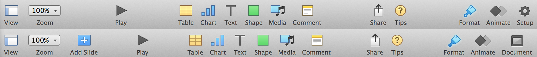
This adds a button I don’t need – add a slide – because I’m a keyboard guy and Cmd-Shift-N works great. They’ve also changed the Setup “inspector” to Document which makes sense in my head. These palettes remain frustratingly docked in the main window. As I’ve written about before, I’m uncertain if this is usability improvement, but I’m about to enter a presentation heavy lifestyle over the next three months. I’ll have a better sense of the use of these embedded palettes.

Preferences were mostly unchanged. They added the ability to show slide layout names which I have not figured out. I can display ruler units as a percentage. Ok. Great?

Animations received love with the addition of new transitions and builds. They also added motion blur to the animations which is is a slick visual flourish you’ll never actually see, but will appreciate. Magic Move adds text morphing which means it will continue to be one of my go to animations as my presentations tend to be text focused1. Magic Move is still baffling to set-up and remains fragile as it relies on multiple slides to be… just right, but I’m happy to see it’s evolution.

Presentation view, I believe, remains functionally equivalent to the prior version, but did receive design love.

keynote-design-love

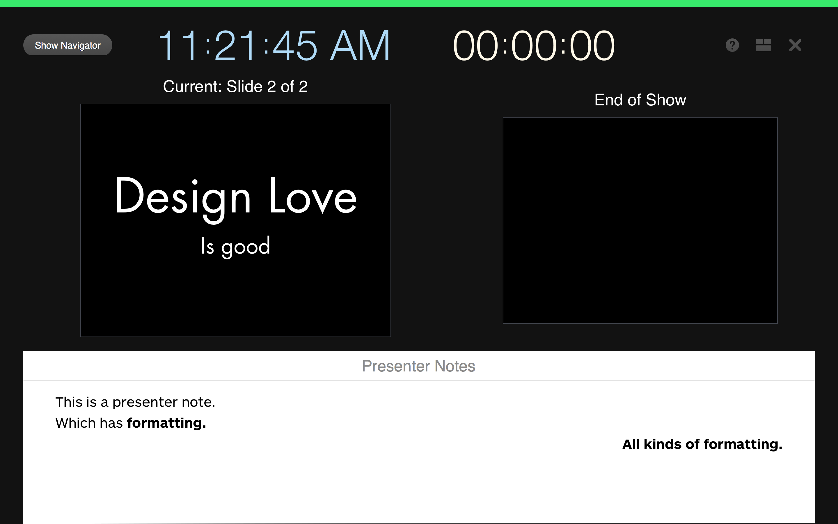
In both practice and play mode2, the presentation view now shows you when you’re ready to proceed with a clear green bar across the top of the view. When an animation is running, this bar is red which is handy. All of the buttons at the top of the window have been increased in size, altered in color, and have better placement to make your presentation practicing easier. Lastly and most importantly, while you still can not perform free form layout of the presentation view, Keynote does allow you to change the style of the presentation notes on a per slide. I’m not sure when this handy feature landed, it wasn’t Keynote 6.2. You still can’t change the presentation notes style at the master slide level which would be convenient and efficient at making sure that presentation notes are optimally sized while in the presenter view.

According to the What’s New update provided by Apple, there are many other new features: Alpha image editing, media browser improvements, custom data formats, improved AppleScript support, support for animated GIFS (yay?) and others. Again, nothing earth-shattering, it’s a house cleaning release and it’s going to take a few weeks of regular use to see if they’ve increased my presentation design joy.


  1. EDIT: I originally thought this was the returning of the same old text transforms. I was wrong
  2. EDIT: There was some stop/advance visual cue work in Keynote 6.1 in real presentation mode, but it appears they flushed it out and finished it in 6.2. 

Enhanced Presenter Display Options

I continue to cautiously use Keynote 6 as my primary presentation design tool. When possible, I also run my presentations off Keynote 6, but this is function of whether the venue will allow me to use my MacBook (usually) or, if not, whether they have Keynote 6 on their presentation machine (usually not).

While there are many other features still missing from Keynote 6, my biggest complaint has been the lobotomization of presenter display features. Specifically, Apple removed the ability to fully customize the presenter (not primary) display and, unfortunately, many presenters learn this when they’re up on stage running their first Keynote 6 presentation and they realize their configured presenter display – the display they use to keep the presentation in their head – has been reduced to a bare set of options where you can enable/display the current slide, next slide, presenter notes, the time, and the elapsed time.

For me, I often place most of my context in my presentation notes. These are notes the audience never sees, but I use to keep track of the narrative – especially when a talk is new. This means I usually make the presentation notes ginormous because that’s what I need to see. My actual slides are usually a couple of words or a photo, what I need is scalable presentation notes.

This is why the recent 6.1 Keynote update piqued my interest – “enhanced presenter display options”. Sweet. A quick scan of the different Mac sites out there revealed absolutely no detail regarding this feature. In fact, most of the sites uselessly parroted the “What’s new” section of Keynote 6; adding zero additional research of their own. Nice job.

Fortunately, I had Keynote 6 on a different machine so I was able to compare and contrast presenter display options and I’m sad to report the following. By enhanced presenter display options, I believe Apple has added the following to the presenter view… a button:

thebutton

This button serves a single function. When presenting, it swaps the two (or more) displays that either show the slide view or the presenter view. Now, as a speaker, I can attest to the need of this button. It’s the first thing to go wrong with a presentation – the audience sees your speaker notes, but it’s a feature that has existed in Keynote for a long time: to swap the displays you hit the X key. This and a slew of other handy presenter display options are visible when you select the ? button above or select the ? in the toolbar above.

Not sure what annoys me the most: the useless description of the feature, the absence of any legit reporting on said useless feature, or the fact this really isn’t a feature. It’s a button.

Speaking

I’ve been known to stand in front of large groups of people, pacing back and forth, waving my hands furiously and talking. I used to get panic attacks when I did this, but after a lot of practice, the butterflies are still there, but I no longer panic. I’ve spoken to very large crowds in… More

Six Years of Rands

I enabled Google Analytics on October 21, 2006, roughly a year after I started using Shaun Inman’s real-time (yet infrequently updated) Mint software. Both packages are part of my daily routine to see what is going on with the site, but I’ve rarely used them for more than understanding the basics: How is this article… More

Keynote Kung-fu Two

You’ve taken some hits. Being taken apart by the execs because they could smell you weren’t prepared. The slide deck you loved that the audience ignored. That guy… snoring. In the front row. However, you’ve also hit it out of the park. The unexpected standing ovation. That seven-slide deck that turned into an hour of… More