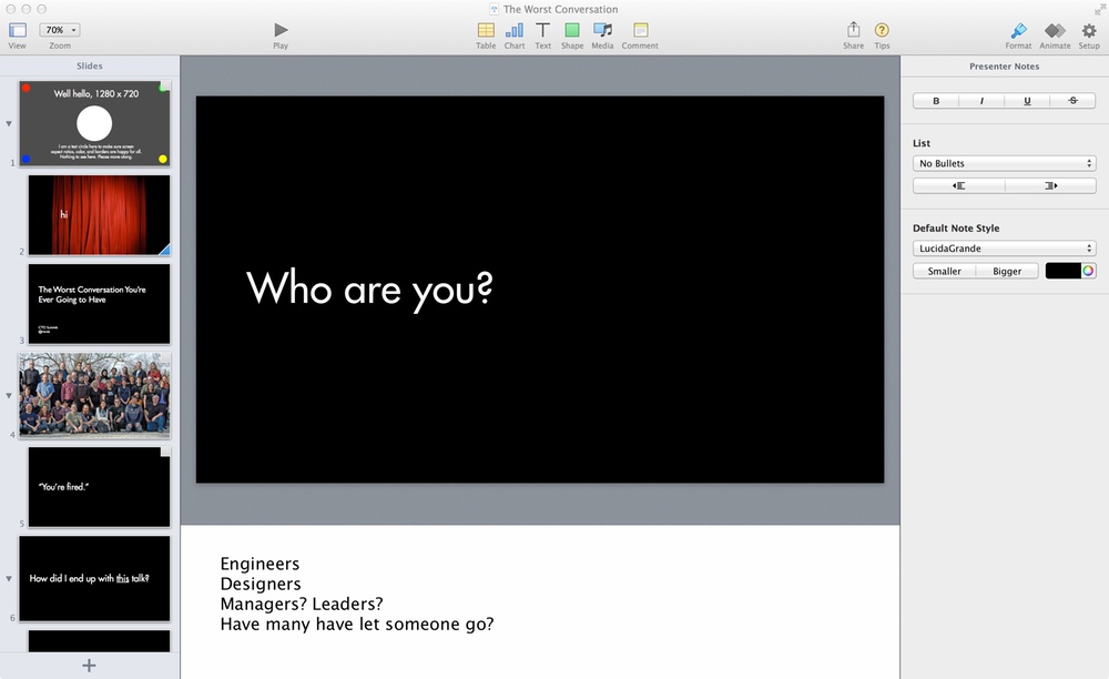
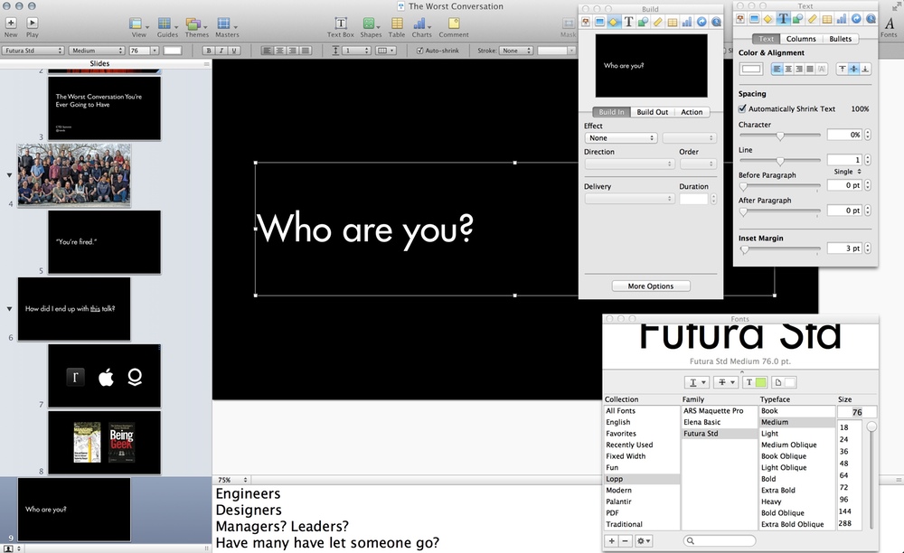
As I’ve written before, I am a comfortable power user of Keynote. My entire presentation development workflow exists inside of Keynote through the use of the outline view, presentation notes, and a bevy of stickies to remind me “need funny image here”.
It took work and patience to build the ideal workflow. I needed to discover that I could have multiple palettes open for heavy formatting at speed. I needed to wait until Keynote provided a practice mode for presentations. And I needed to fully understand the value of a well-architected set of master slides.
I love Keynote. Prior to Keynote 6, I’ve been fond of saying that if you want to see an Apple product dripping with Steve Jobs’ influence, take a look at Keynote.
A Couple Kinds of Simple
The story I’m telling myself about the Keynote 6 redesign (and I’m assuming all of iWork; I only use Keynote, but the applications share common user interface frameworks) is that a very smart person who is a User Experience Expert was given carte blanche to redesign the interaction flows within Keynote with the goal of simplifying the experience.
They and their team did a lot of research. They became experts in how different people accomplished different tasks inside of Keynote, and when they felt they had enough research, they asked themselves, “Where can we simplify?”
I’m wondering about their definition of simple. There’s the simplification where you clean your desk. The clutter on your desk is bugging you, so you decide to clean it up. This small act of simplification gives you the pleasant illusion that the world contains less chaos and you can suddenly magically focus on the task that you were procrastinating on while you were cleaning your desk.
The other version of simplification is harder. This is the simplification where you spend the weekend rearranging your garage. This process still involves tidying, but its primary goal is to answer the question: “How am I going to get work done more efficiently?” You look at all your tools, you remember recent projects and what was hard and what was easy, and using these thoughts you embark on a weekend-long quest of simplification where the goal is improved efficiency.
At a glance when I compare Keynote 6 followed by its predecessor in my full Rands presentation design mode, the question is: “Were they cleaning the desk or the garage?”
First, the folks who are claiming that Keynote 6 has been dumbed down are looking at the application, not using it. They see the absence of familiar clutter and the removal of features as a sign that it was a shallow desk cleaning, not a deep garage redesign. I’ve worked with Keynote 6 enough to experience the redesign intent… I feel someone is trying to make my Keynote life easier. Master guides (finally), context-aware embedded palettes, and styles – these are features I need and will use every single day.
It’s too early to say this definitively, but from my initial work, my impression is that I will be able to move faster in the new version. But that doesn’t mean I’m still not concerned.
Absence and Direction
For software consumed by humans, there are three broad categories:
- Consumer software. Think iTunes. Think iPhoto. Any normal human can use it to get the task done. No training. No manuals.
- Pro software. Think Final Cut Pro X. Logic Pro X. To get significant value out of the software, you must spend time learning it. While you might be able to plunk plunk plunk along, the software is not designed for average human beings.
- Prosumer software. Somewhere in the middle. Think Lightroom. Think Aperture. Maybe Photoshop. The average human being can get immediate value out of using the software, but as you continue to use it, you discover there is a whole world of other features hiding under the surface. Unlike Pro software’s deliberately hostile learning curve, Prosumer software’s learning curve is inviting – you may never need the advanced features of the package, but you are likely going to be exposed to them as part of your casual usage.
The removal of significant features is strange, but my hope is that any important feature will return. Apple is known for big bang releases, and along with the release of Keynote 6, they were also announcing the iPad Air, the iPad Mini, and upgraded MacBook Pros. Launching all of these products in the same amount of time is a project management nightmare. My guess is that the answer to the question: “Do we delay the release so we can have Smart Builds?” is: “Suck it up, Smart Builds.”
However, the missing features do fit into the category of advanced or prosumer features, and while I understand why they were prioritized last, the question remains: “Is Keynote a consumer or prosumer application?”
As an avid user, I desperately want it to be prosumer because a prosumer application grows with you. The more you ask of it, the more the application reveals well-designed complexity.
Fact: There are far more people out there who are just looking to throw together a presentation. They’re going to use a default template with standard typography. Maybe they’ll throw in an animation, but probably not. 45 minutes later and they’re blissfully done and gratefully not using PowerPoint.
These folks are likely going to be happy with Keynote 6, especially now that it’s free and there are far more of those folks out there than of me. For me, presentation design is a multi-day affair where I sweat each slide. I have an opinion about each animation and how long it should last. I have developed and designed my own master slide deck. I will kern if kerning is required.
I understand that Keynote 6 is a big investment in the consumer and that is a sensible place to invest, but if subsequent releases don’t invest in the users who legitimately design inside of the application, I’m going back to the garage to find a tool that grows with me.
4 Responses