Tag: presentations

So You Want to Fix Your All Hands

I will now explain why at least 50% of your team finds your current All Hands to be a waste of their time. They believe: Now, I will describe how to build an All Hands that will exceed their expectations. Let’s define the All Hands: Everyone. Together. There’s an important organizational inflection point when you… more

June 29, 2026 5 Comments

The Worst Seven Minutes

The worst seven minutes of a presentation are the seven minutes before you present. Writing a deck, editing it, getting feedback, rewriting it, practicing it over and over again, final touches, one more practice, ok two more practices and now you’re standing stage left waiting those last seven minutes with absolutely nothing to do except… more

May 2, 2018 6 Comments

The Next Big Thing

The icing on the cake when I do a presentation is Q&A. Being peppered with random questions might seem problematic, but I love it. First, because it tells me what the audience heard and, second, because it allows to me fill in the gaps of the presentation.

There are a standard list of questions I get on a regular basis, and one of them is, “If you were going to found a start-up, what would it be?” My answer has been consistent for the past five years, “I don’t know how I’d do it nor how I’d make money, but I would provide a service which allows a human to determine the source of a piece of information.”

Everyone suddenly cares about this idea a lot. Facebook recently announced it’s plan to vet alleged fake news with five different independent news/fact-checking groups. These groups are:

I remain jaw on the floor shocked how much opinion that swirls me is repackaged as facts. I’m not pointing the finger at a particular demographic; I’m talking about everyone (including myself) who says, “That insert-fact-here just feels wrong.” We are 100% entitled to our opinions. Our views are also protected. However, usage of an opinion as fact is rotting our national discourse.

Kudos to Facebook for taking action, but a better course of action is when you hear or read a fact that seems just plain off check out one of the sites above get the real facts.

p.s. There is a fact-checkers code of principles.

December 22, 2016

You Find People to Be Both Intriguing and Exhausting

I’ve been working on a talk about public speaking for a few weeks and I open with my worst public speaking experience. I tell the story of how I got up in front of the engineering team at my first start-up and had a full blown panic attack. Slide 7 of 15 – full stop. Couldn’t continue.

Most humans don’t like speaking in front of other humans and for me that situation is only exacerbated by being a self-identified introvert.

Thing is… I like public speaking. It’s a high. I get energy from the room and I’ve never been able to reconcile my introversion with this aspect of public speaking. Good news: outgoing introverts.

From The Muse – Outgoing Introverts Do Exist. Here’s one of the 10 signs:

It Actually Takes Less Energy to Say What’s on Your Mind Than to Make Small Talk

Introverts like talking about ideas or connecting authentically. Fake small talk bores you and drains your life force.

Yes. Right. Totally.

April 10, 2016 1 Comment

I Think in Outlines

One of the key tenets I talk about regarding understanding the engineering mindset is that software engineers think in terms of flow charts. This isn’t exactly correct – engineers think in code, but most of the planet does not, but, chances are, they understand the concept of a flowchart. You’re in a state. When certain… more

May 21, 2014 18 Comments

Very Important Strangers

A few weeks ago I spoke at the excellent re:build conference in Indianapolis, Indiana. While it was my first time in Indiana, the setup was familiar. 200+ attendees, great venue, single track, and conference coordinators who know how to put on a great conference. (And one surprisingly gotham-y gorgeous building.) I was the last speaker… more

May 4, 2014 8 Comments

Presentation Design Joy

As appears to be tradition now with the iWork suite of applications, Apple is slowly updating the applications to both address minor issues as well as introduce functionality that was removed in the most recent major update.

As is now custom, I keep the old version of Keynote around to compare and contrast feature set because while Apple’s “What’s New in Keynote” is useful, it often neglects to mention interesting changes to functionality and design.

The headline is: nothing earth-shattering has landed in Keynote 6.2 that is going to affect my presentation design workflow. To determine this, I compared toolbars, preferences, inspectors, and menu bars between Keynote 6.1 and 6.2. It’s not an exhaustive comparison, but this is where I tend to spend my time and any improvement has potential to increase my presentation design joy.

So, yes, the toolbar is updated. Keynote 6.1’s toolbar is on the top, Keynote 6.2 is on the bottom – click to see a larger version:

keynote toolbars

This adds a button I don’t need – add a slide – because I’m a keyboard guy and Cmd-Shift-N works great. They’ve also changed the Setup “inspector” to Document which makes sense in my head. These palettes remain frustratingly docked in the main window. As I’ve written about before, I’m uncertain if this is usability improvement, but I’m about to enter a presentation heavy lifestyle over the next three months. I’ll have a better sense of the use of these embedded palettes.

Preferences were mostly unchanged. They added the ability to show slide layout names which I have not figured out. I can display ruler units as a percentage. Ok. Great?

Animations received love with the addition of new transitions and builds. They also added motion blur to the animations which is is a slick visual flourish you’ll never actually see, but will appreciate. Magic Move adds text morphing which means it will continue to be one of my go to animations as my presentations tend to be text focused1. Magic Move is still baffling to set-up and remains fragile as it relies on multiple slides to be… just right, but I’m happy to see it’s evolution.

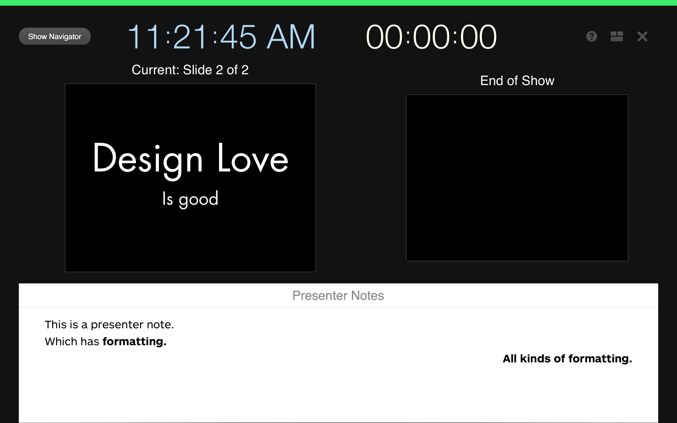
Presentation view, I believe, remains functionally equivalent to the prior version, but did receive design love.
keynote-design-love

In both practice and play mode2, the presentation view now shows you when you’re ready to proceed with a clear green bar across the top of the view. When an animation is running, this bar is red which is handy. All of the buttons at the top of the window have been increased in size, altered in color, and have better placement to make your presentation practicing easier. Lastly and most importantly, while you still can not perform free form layout of the presentation view, Keynote does allow you to change the style of the presentation notes on a per slide. I’m not sure when this handy feature landed, it wasn’t Keynote 6.2. You still can’t change the presentation notes style at the master slide level which would be convenient and efficient at making sure that presentation notes are optimally sized while in the presenter view.

According to the What’s New update provided by Apple, there are many other new features: Alpha image editing, media browser improvements, custom data formats, improved AppleScript support, support for animated GIFS (yay?) and others. Again, nothing earth-shattering, it’s a house cleaning release and it’s going to take a few weeks of regular use to see if they’ve increased my presentation design joy.


  1. EDIT: I originally thought this was the returning of the same old text transforms. I was wrong. ↩
  2. EDIT: There was some stop/advance visual cue work in Keynote 6.1 in real presentation mode, but it appears they flushed it out and finished it in 6.2. ↩
April 6, 2014

Enhanced Presenter Display Options

I continue to cautiously use Keynote 6 as my primary presentation design tool. When possible, I also run my presentations off Keynote 6, but this is function of whether the venue will allow me to use my MacBook (usually) or, if not, whether they have Keynote 6 on their presentation machine (usually not).

While there are many other features still missing from Keynote 6, my biggest complaint has been the lobotomization of presenter display features. Specifically, Apple removed the ability to fully customize the presenter (not primary) display and, unfortunately, many presenters learn this when they’re up on stage running their first Keynote 6 presentation and they realize their configured presenter display – the display they use to keep the presentation in their head – has been reduced to a bare set of options where you can enable/display the current slide, next slide, presenter notes, the time, and the elapsed time.

For me, I often place most of my context in my presentation notes. These are notes the audience never sees, but I use to keep track of the narrative – especially when a talk is new. This means I usually make the presentation notes ginormous because that’s what I need to see. My actual slides are usually a couple of words or a photo, what I need is scalable presentation notes.

This is why the recent 6.1 Keynote update piqued my interest – “enhanced presenter display options”. Sweet. A quick scan of the different Mac sites out there revealed absolutely no detail regarding this feature. In fact, most of the sites uselessly parroted the “What’s new” section of Keynote 6; adding zero additional research of their own. Nice job.

Fortunately, I had Keynote 6 on a different machine so I was able to compare and contrast presenter display options and I’m sad to report the following. By enhanced presenter display options, I believe Apple has added the following to the presenter view… a button:

thebutton

This button serves a single function. When presenting, it swaps the two (or more) displays that either show the slide view or the presenter view. Now, as a speaker, I can attest to the need of this button. It’s the first thing to go wrong with a presentation – the audience sees your speaker notes, but it’s a feature that has existed in Keynote for a long time: to swap the displays you hit the X key. This and a slew of other handy presenter display options are visible when you select the ? button above or select the ? in the toolbar above.

Not sure what annoys me the most: the useless description of the feature, the absence of any legit reporting on said useless feature, or the fact this really isn’t a feature. It’s a button.

January 25, 2014 4 Comments

Fix Your Boring Slides

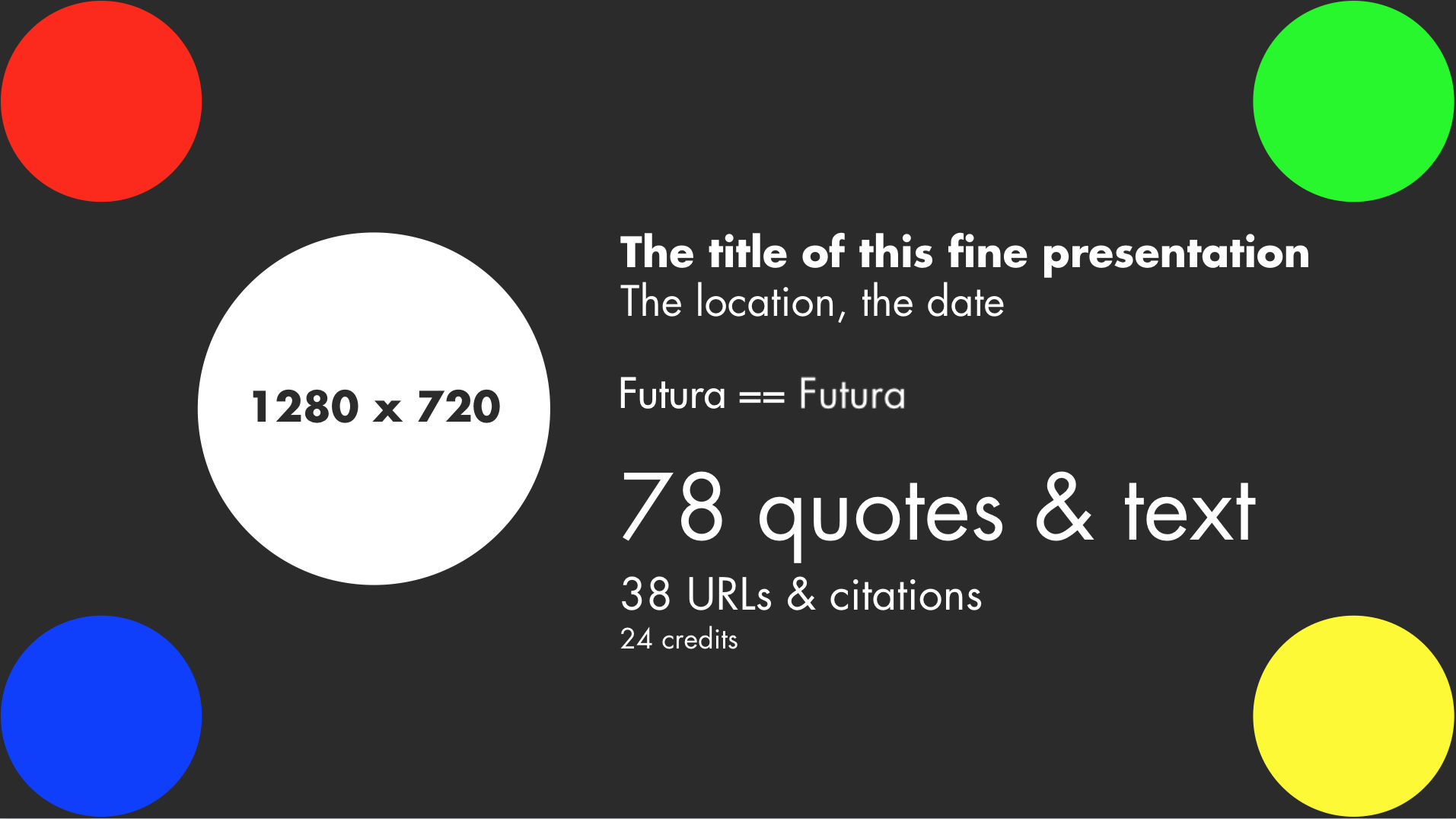
Sticking with our Keynote theme for the week, Andy has solid and usable advice for building your non-boring slide deck. One thing I would add is to create a test slide at the beginning of your deck which contains the following:

  • A border which represents the expected resolution of your slides,
  • A set of colored objects which you know,
  • Text formatted in the fonts you use in your deck, and,
  • A big circle.

Something like this:

Slide Check Slide

The reason for this slide is so that when you’re doing that inevitable run through of your deck, you can easily answer the questions:

  • Is all of the usable space on your slides being displayed correctly.
  • Do the colors look right?
  • Are your fonts loaded correctly?
  • Is the aspect ratio correct on your slides? (Hint: if the circle isn’t a circle, it’s not)

UPDATE: Here’s an awesome fork by Tim Brown in Keynote.

SECOND UPDATE: Here’s the current version that I’m using which is used in the screenshot above. You’ll likely receive a font warning when you open this and that’s the point.

November 15, 2013 1 Comment

Desk or Garage Design?

As I’ve written before, I am a comfortable power user of Keynote. My entire presentation development workflow exists inside of Keynote through the use of the outline view, presentation notes, and a bevy of stickies to remind me “need funny image here”. It took work and patience to build the ideal workflow. I needed to… more

November 13, 2013 4 Comments