Excerpt

Killing Mental Friction

Brief productivity update. As I noted at the end the year, I moved from Things to Asana. After the initial excitement and eager eager that accompanies any new bright and shiny product, my Asana usage tanked. The issue? First, I was using it like I used Things and, second, I didn’t know Asana.

As I’ve written about before, my personal workflows are bereft of complexity because each sliver of complexity creates mental friction and aggregate excess mental friction is why I abandon tools. My initial Asana workflow was an exact mirror of Things – the reason, I didn’t want to reinvent my flow. After a week, it was clear from increasing that with Asana that I was forcing my square-peg workflow into a round product.

After several weeks of watching Asana slowly gather digital dust, I rebooted. First, I watched every single Asana video available. Oh, it all revolves around the inbox. Ok. Second, I became the master of all Asana keyboard shortcuts. This might well be a nerd thing, but part of the reason I knew Asana is built for me is they’re big on keyboard shortcuts and, for the nerd, the single biggest killer of mental friction is memorized keyboard shortcuts. Lastly, and as you’ll read in an accompanying forthcoming article, I reinvented and rebuilt my workflow in both my email client and Asana. Accompanied with a better understand of Asana’s features, this blank slate approach allowed me to build around Asana’s feature set. Two weeks later and this revamped workflow feels familiar and productive.

My workflow is a work in progress. I’m still experimenting, but, then again, so is Asana. This week they released a Calendar feature. I haven’t extensively used the feature, but I sleep better at night knowing my tools are actively thinking about how to grow and evolve with me.

Enhanced Presenter Display Options

I continue to cautiously use Keynote 6 as my primary presentation design tool. When possible, I also run my presentations off Keynote 6, but this is function of whether the venue will allow me to use my MacBook (usually) or, if not, whether they have Keynote 6 on their presentation machine (usually not).

While there are many other features still missing from Keynote 6, my biggest complaint has been the lobotomization of presenter display features. Specifically, Apple removed the ability to fully customize the presenter (not primary) display and, unfortunately, many presenters learn this when they’re up on stage running their first Keynote 6 presentation and they realize their configured presenter display – the display they use to keep the presentation in their head – has been reduced to a bare set of options where you can enable/display the current slide, next slide, presenter notes, the time, and the elapsed time.

For me, I often place most of my context in my presentation notes. These are notes the audience never sees, but I use to keep track of the narrative – especially when a talk is new. This means I usually make the presentation notes ginormous because that’s what I need to see. My actual slides are usually a couple of words or a photo, what I need is scalable presentation notes.

This is why the recent 6.1 Keynote update piqued my interest – “enhanced presenter display options”. Sweet. A quick scan of the different Mac sites out there revealed absolutely no detail regarding this feature. In fact, most of the sites uselessly parroted the “What’s new” section of Keynote 6; adding zero additional research of their own. Nice job.

Fortunately, I had Keynote 6 on a different machine so I was able to compare and contrast presenter display options and I’m sad to report the following. By enhanced presenter display options, I believe Apple has added the following to the presenter view… a button:

thebutton

This button serves a single function. When presenting, it swaps the two (or more) displays that either show the slide view or the presenter view. Now, as a speaker, I can attest to the need of this button. It’s the first thing to go wrong with a presentation – the audience sees your speaker notes, but it’s a feature that has existed in Keynote for a long time: to swap the displays you hit the X key. This and a slew of other handy presenter display options are visible when you select the ? button above or select the ? in the toolbar above.

Not sure what annoys me the most: the useless description of the feature, the absence of any legit reporting on said useless feature, or the fact this really isn’t a feature. It’s a button.

Crafting Purposefulness

Sally Kerrigan on A List Apart:

Because writing—that first leap into taking your idea and making it a Thing People Read—isn’t really about wording. It’s about thinking. And if you can tell the difference between an article that knows what it’s about and one that exists purely to sell ad space, then you’re pretty good at that already.

Start with something messy, get to the point, get an editor, and make it good. Kerrigan’s excellent advice finishes with one of my favorite lines in her piece, “This is what crafting purposefulness looks like.”

Appreciated, but Never Seen

I’ve been collecting videos that represent views of professions and acts that I’ve appreciated from a far, but have never really seen:

Beer is a living breathing (creepy) thing:

Landing an Airbus 380 at SFO:

http://www.youtube.com/watch?v=k3HKN-FWNq0

A camera on a hockey referee’s helmet:

http://www.youtube.com/watch?v=ZEBoOr12BrI

And a football quarterback:

Front row seats for a NASCAR crash:

And jumping from a very high spot:

A Story Briefly Told

Sometime during the Christmas of 1993, my wife scared the shit out of me in my office. She achieved this by walking up behind me and putting her hands on my shoulders while I was playing Myst for the first time. I no longer recall where I was in the game, what I remember was I was deeply lost in the evolving narrative of the game – I was on this island, strange events were occurring, and I was trying to figure them out before… before what? I don’t know what was going to happen – I was freaked out and more so than when my wife’s hands landed on my shoulders and I leaped out of my chair.

In 1993, Myst was a technological feat. It was an effortless blend of pre-rendered images with just enough Quicktime video to give you the impression the world was alive. The arrival of Myst drove adoption for the then-nascent CD-ROMs, but while the technology was amazing, what cemented Myst in my memory was how I became engrossed in a story that was barely being told. It was being experienced.

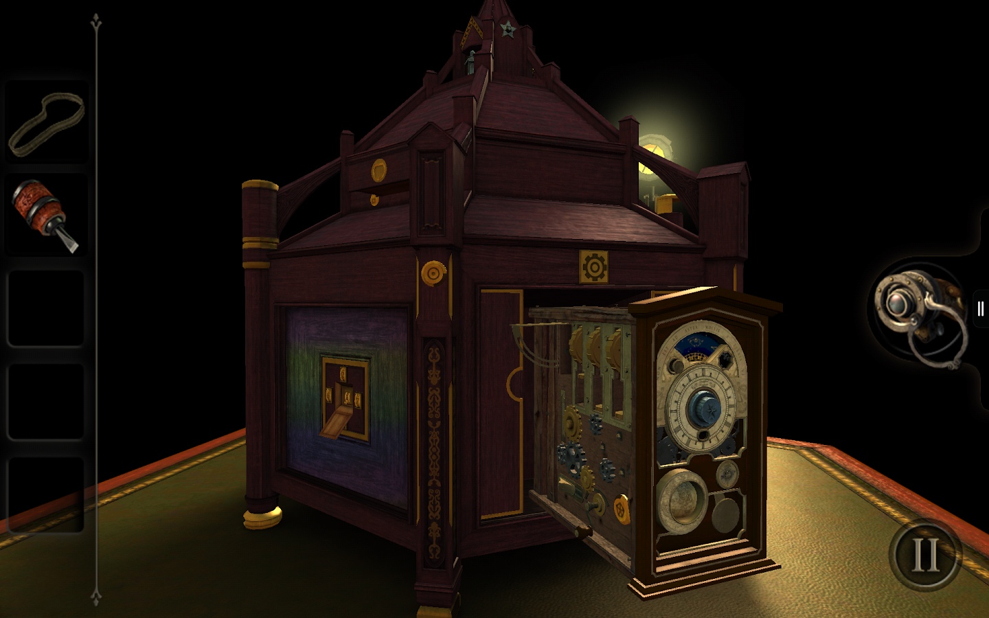
The reason I’ve been thinking about this is that sometime during the Christmas of 2013, my wife scared the shit out of me again. She achieved this by simply rolling over in our bed while I was playing The Room 2. The Room and The Room 2 are iPad games. The premise of the first game is extremely simple: you’re in a dark room and there is a safe. On top of the safe, is a note, some books, and a smaller chest. Your goal: via puzzles find the narrative.

The Room

The puzzles are not complex. You’re going to figure them out by paying attention, noticing details, and experiment. Again, what drives the game, like Myst, is the evolving narrative – what the hell is going on here? Unlike Myst, The Room began on a smaller scale, but with vastly better technology at its disposal. If you think there are no truly great iPad games that show off the hardware and the touch interface: you are wrong and for a mere $.99 you can correct this misconception. But to understand how my wife freaked me out, it’s going to cost you another $4.99

See, the success of The Room allowed developer Fireproof Games to evolve the story in the sequel. There are many rooms with many different kinds of puzzles and in an effort to keep this brief review spoiler-free – there is something else. It’s a thing which is hinted at, it’s hiding in the shadows, and while you might never see it, it’s going to freak you out.

Losing Aaron

Janelle Nanos in Boston Magazine:

Comprehensive and compelling article on the death of Aaron Swartz. Elegantly written. Includes details from the MIT-commissioned investigation by professor Hal Abelson that documents:

[The Abelson reports] notes that “MIT is respected for world-class work in information technology, for promoting open access to online information, and for dealing wisely with the risks of computer abuse. The world looks to MIT to be at the forefront of these areas. Looking back on the Aaron Swartz case, the world didn’t see leadership.”

Conversation Power Moves

Megan Garber in The Atlantic:

Conversations, as they tend to play out in person, are messy—full of pauses and interruptions and topic changes and assorted awkwardness. But the messiness is what allows for true exchange. It gives participants the time—and, just as important, the permission—to think and react and glean insights. “You can’t always tell, in a conversation, when the interesting bit is going to come,” Turkle says. “It’s like dancing: slow, slow, quick-quick, slow. You know? It seems boring, but all of a sudden there’s something, and whoa.”

My current conversation power move is eye contact. Eye contact. All the time whether I’m speaking or listening. For speaking, my natural state is to look away when I’m talking so I can focus on what I’m attempting to say, but I miss essential nuanced feedback. For listening, eye contact can feel uncomfortable because it can feel like staring, but, again, if you look away, you might miss essential conversational data.