It’s WWDC season and that means Keynote. Lots of it. Today is Sunday and I’ve clocked 6 hours of Keynote and I’m ok with that. Keynote doesn’t get in my way and Keynote doesn’t piss me off, so I’m taking a break from endless slides to give Keynote some credit and to give you some Keynote tips.
If you’re a power Keynote user, you can skip this piece. This is basic Keynote blocking and tackling.
Prepare Your Workspace
 If you settling into a long Keynote session, I will now save you 10 minutes. Turn on the following palettes: Inspector, colors, and fonts. 90% of the tweaking you’re going to need to do is in these palettes and rather than switching them on and off, I want you to find a comfortable place on your desktop. Me, I put the inspector and colors next to each other with fonts below. It’s tidy.
After you’ve got your palettes set-up, let’s head over to preferences and save you some time there. I run with standard preferences except for the rulers. Go ahead and click there now.

There are three things I change here before I begin. First, I change the alignment guides to a different color. The default yellow is distraction and often conflicts with objects on the page. I use a sky blue.
Second, I turn on both “Show guides at object center” and “Show guides at object edges”. Enabled these last two preferences create all sorts of alignment guides when you move an object around the page. These guides are one of my favorite features because I have grid issues. It’s hard for me to leave a page without things aligning just-so and the plethora of alignment guides makes my alignment job easy.
Explore the Inspector
 The use of color and font palettes is obvious, but you probably don’t know everything which is going down in the inspector. Take a few minutes to explore each of the panels and understand their function. This is where the cool goes down. Some random cool:
- Hate your slide size? You can change it on the document panel.
- Love transitions? Remember that there are two major animation panels: one for the slide transitions and another for per-object build transitions.
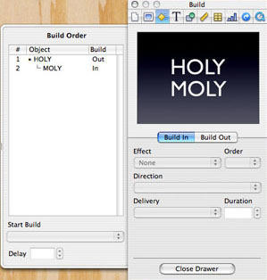
- The build panel is the heart of transitions in Keynote. This is where you set per-object transitions, but most folks don’t know that you can get really crazy by opening up the ‘More options’ drawer. The drawer allows you to see all the transition on the current page, lets you reorder them, and let’s you chain transition events together. More on this in a second.
- I know I told you to put the color palette up and you’re going to want to click on it, but you often need to specify the object you want to change in the inspector before you can change the color. Remember, if the color isn’t changing, you need to select in the inspector first. You’ll get used to it.
My last piece of advice regarding the inspector is to play because that is how you’ll get creative. If you’re wondering if you can change the opacity of that photo, go ahead and try it out. You probably can.
Organize Your Iteration
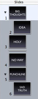
 My slides always start as an outline and the fact that I can easily indent and group slides via the navigator means I can easily iterate through thoughts as they cross my mind. Like any good outliner, simply hitting tab indents a slide or a slide group — shift-tab does the opposite.
As my slide set evolves I’m constantly moving slides around as well as adding and deleting content. Often I have a slide which has a thought I want to keep around, but I don’t want to include as part of the presentation. Right clicking on the slides gives you the option to skip a slide. This removes the slides from the presentation, but not from the slide set. Handy.
If you’re working on a text heavy presentation, you can always switch to outline view in the navigator. This displays text only in the navigator and is useful in early versions of slides where all your scrubbing is ideas and not visuals.
Lastly, as random thoughts which don’t have a home show up, I’m torn between sticking them into stickies or dropping them in the presenter notes. The sticky approach has the advantage of being in your face whereas presenter notes scale. Presenter notes also show up in the presenter view which might be the single best reason to use them.
Pull It All Together with The Fade
A sure sign of a Keynote rookie is transition insanity. This is when every single slide and object has it’s own transition and it’s a visual mess. Defining a design aesthetic for Keynote is beyond the scope of this brief mental break of a piece, but I will say, “The best transitions are the ones you don’t see”.
One of my favorite combined transitions is the fade. This is when you choose to emphasize or de-emphasize an element on the page by changing the opacity. This is easy now that you’ve discovered the ‘More options’ drawer in the Build palette. Let’s try it:
- First, duplicate the object you want to de-emphasize. Set the opacity on the duplicate to whatever you want it to eventually be.
- Second, select the original object and set the Build Out transition to Dissolve. Now, move the duplicate object directly on top of the original.
- Run the presentation and see what you’ve got. A nice fade on your original object, but let’s also emphasize another object.
- Add another object to page and put a Build In transition of Dissolve.
- Now go into the Builds drawer and note you have two transitions there. Select the second transition and select the Start Build drop down and choose the “Automatically with build 1” option.
- Finally, select the first transition and select “On Click” from the Start Build drop down.
Run the presentation and see what happens. You’ve combined two transitions into one into a pleasing fade. AAAaaaaah. Simple, clean, and easy.
Ok, back to work.
I’m well-versed in Keynote kung-fu, but I went ahead and read your article anyway.
“Right clicking on the slides gives you the option to skip a slide.”
I didn’t know! Very nice, thanks!
One thing that I have found really useful in Keynote is that you can have multiple Inspector windows open.
For example, if I’m working in the Build tab and I need to adjust something quick in the Object tab, I can go to the Object tab with my 2nd Inspector window and leave my Build tab how I had it.
While I knew the stuff discussed in this particular article, I have to say Keynote is probably one of my favorite apps on the mac, and far more powerful than you’d first come to think…
After getting back from WWDC, I’ve been so inspired from the presentations, that I’ve found myself just making and perfecting presentations in Keynote. Presentations that I’m not even sure I’ll ever hold.
I can still stumble upon great new features, just by accident. (Just learned a whole lot, just by bumping into the “Help”-button during a presentation, for instance…)
Something you might find useful is the newly released iWork ’08 Keynote now actually can fade an object as a new “Action” (part of the Build In/Build Out suite, it’s now Build In/Actions/Build Out).
“A sure sign of a Keynote rookie is transition insanity. This is when every single slide and object has it’s own transition and it’s a visual mess.”
You mean “…has its own transition and it’s a visual mess.”
.