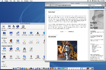
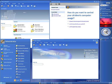
For you visual ascetic types, here is Jaguar sitting next to Longhorn.
UI hurts:
-Apple has a dock, a desktop, and a magical strip of desktop that maximizing avoids.
-Microsoft has two taskbars/dockish things and a desktop that items magically disappear from.
Talk amongst yourselves.
(Okay I know Apple doesn’t like maximizing because it prevents people from seeing the puppies on your desktop and from what I remember of using OS X the feature is nearly/always absent except maybe for iMovie because it’s special or what. Idea is that OKAY NOW THAT MONITOR SIZES ARE ALMOST ADEQUATE FOR EARLY ’90S IDEA OF DESKTOP WE FINALLY GET REAL-ESTATE SAVING FEATURES THAT WILL ALL SCALE POORLY TO VIDEOWALLS SO WE PROBABLY GET TO GO THROUGH ANOTHER REDESIGN OF EVERYTHING IN 2012 BUT THAT’S OKAY BECAUSE WE ALL KNOW BRANDING IS WHAT REALLY INCREASES PRODUCTIVITY.)
For eli: Somewhere in the realms of “bullshit people come up with pertaining to usability,” it’s suggested that text columns beyond a certain width is supposed to require too much eye movement and increase reader fatigue. This is theoretically why magazines and newspapers arrange text in columns which are vertical but it’s really all personal preference so if you hate it huaghluaghluagh.
Microsoft does it in the (very QNX-Shelf like and no the Shelf is not called Photon Photon is the QNX equivalent to the X server) taskbar, Apple does it in trying to convince you that all your windows should follow some sort of vertical golden-rectangle thing.
I don’t consider this a major point of difference, because we all know you can move Apple’s dock and MS’s taskbars around (and as of XP, MS’ bars finally pretty much ‘work right’ in any position).
ALSO I AM NOT PICKING SIDES I’M SAYING BOTH INTERFACES MAKE MY BRAIN BLEED.
A friend of mine who works at Microsoft told me that the “Plex” style that has been circulating around the Internet is actually not what Longhorn is going to look like. He showed me some screen shots of what they are anticipating Longhorn to look like and it is nothing like this at all. It’s not even really like any currently existing Windows. It reminded me more of Rasterman’s Enlightenment than anything else.
Of course, this is Microsoft and they’ll probably change the design a dozen times before release.
Holy god Safari sticks out like a sore thumb in that shot. This is probably the best and most succinct visual argument yet for why the Brushed Metal quasi-theme SUCKS SHIT.
Longhorn (or whatever that shot is of) is cluttered and weird, but at least in a consistant fashion. OSX looks…how can I put this? Like a linux desktop. Everything’s one consistant beautiful theme except for that one goddamn app (mozilla, xcdroast, rxvt, whatever, haluahg) that refuses to play along. It just sits there poking you in the eye every five minutes to remind you that it’s there.
You’d think Apple would know better than to imitate this idiocy.
Longhorn is a bit blue. Well, bluer than OS X anyway. I think Microsoft is addicted to that colour.
BTW, what is up with that clock on the Windows shot? And what’s up with the task bar on the right? Didn’t MSFT ever study usability? The language is best read horizontally, and seems more suited for a left-to-right read.
Also, my UltimateTV sattelite system upgraded itself last night, and it now supports a start menu. I shit you not.
I was going to spurt out that argument here, but I never got around to it. See, Apple’s success post-Jobs-hire has revolved around giving the customer what they really want- What’s Cool.
OS X is founded on a primal awareness of two things – fashion changes on a daily basis, and the Open Source/*NIX space cranks out a lot of shit for free on a daily basis.
The iMac wasn’t particularly new, different, or enduring, but Apple spared no effort in ensuring it was Cool, from the initial industrial design to the neverending product placements. If there’s one thing Jobs knows, it’s Brand Engineering. (Unfortunately, he did so well with NeXT- core branding: ‘The computer you will sell your children for.’- that the only customers were those who really wanted/needed to look like they’d sold their children.)
Anyhow, OS X sets up an interface between You, the Customer Out There in Middle America, and the Freshmeat slaughterhouse. At first, it looked like Quartz would be the filter to determine the wheat from the chaff, but Coolness travels on Internet Time (read: Geeks laud friends for choosing OS X. Geeks tell friends about Mozilla, OpenOffice. Friends ask geeks to actually, say, *install* same. Geeks discover they really do live in Hell.), so they ship the headless X server.
Result: Middle America is pleased. They get to revel in the New Hotness even before the Windows crowd, and the Switchers have already learned to associate butt-fuggly windows with Branding. (See: AOL. WinAMP.) Consistency is not on their minds until it bites them in the ass; the experience may never be fully ‘stable’ (as in: nobody will be allowed off the upgrade treadmill), but that’s the price you pay for the illusion that you are a Hip, Happening Mover and Shaker.
For those concerned, there will always be the boneless chicken- iApps, Safari, and so forth- which will retain brushed-metal consistency among themselves. Keeping the theme proprietary to Apple ensures that those wanting/demanding consistency will come back to the Store before throwing their money at some third party, especially one that doesn’t subjugate to the standard Aqua look.
In other words, Apple’s thrown off the shackles that were keeping it down through the ’90s. If the system *is* consistent, reliable, and responsive, where’s the upgrade motive? Make the slide to Good Enough engineering- with the faith that your engineers will be so disgruntled as to keep your Good Enough better than everyone else’s- blind everyone with a blast of Fashion, and suddenly you’ve got a functioning business model again. If the market is growing, pretend you’re at a stable milestone; if it threatens to contract, force a Buy-It-All-Over-Again event that brings in some revenue and dazzles a few more onlookers into jumping on board.
(With the apparent loss of the G5 and the wait for the 970, Apple’s level of choice in triggering a true repurchasing event has been limited. The Music Store seems to have been total serendipity, and another creepy example of Jobs’ associative intellect: If you can’t pull a ‘smash hit’ out of your own sleeve on time, make a fast- and prolonged- buck reselling others’.)
In Windows, I am a MAXIMIZER. I also go full screen because I want to focus on what I’m working.
AS WAS MENTIONED, Mac OS X does not lend itself to full screen maximize. One would think I’d hide the dock to reduce clutter, but for some reason I keep it up… whenever I hide the thing, I get an itch to bring it back. No clue why.
Floid:
I agree with you on all points. I recall that the width issue is for text, and not necessarily for icons.
Anyway, I hide my dock and my start bar (when I’m at work and forced to suck from the microcock) so the resize isn’t really restricted on my system.
Someone once mentioned that the little (+) in aqua is actually for user/preset window sizes and not for full screen. It should have a ‘R’ for restore, instead.
The golden rectangle has been used by typesetters since Gutenberg, so I guess it just stuck 😉
A little postscriptum on NeXT: let’s be realistic here. NeXT’s problem wasn’t some kind of metaphysical over-success in branding: its problem was that regardless of whether you wanted to sell your children for it, at $7,000 per station you’d HAVE to, and it shipped so late that by the time you even had the option, your children had grown up to the point where they might stand a chance of physically resisting.
Even Steve Jobs at the height of his cocaine days could not convince more than a handful of people that they wanted to pay $7,000 for a computer with no applications. The NeXT wasn’t the too-good-to-succeed predecessor of the iMac, it was the too-cool-for-school son of the Lisa.
Dr. M: It was a gag, point being that he looked good doing it. Better than he did with the Lisa.
It takes a real UI nerd to want one of *those* (not that one can find them, what with the whole landfill thing), but a few of my hip, happening Linux-geek friends have gone out of their way to acquire cubes. Apple was the original beige box company; NeXT was about creating fetish-objects.
[Insert blather about Apple as a company of compromises here, Mac -> IIgs -> melting/cracking/warping laptops.]
If I’d been smoking less crack I’d’ve remembered to prepend that with:
Eli: Icons? In that Microsoft’s bar shrinks when viewed so, or that they should be ordered left-to-right? No matter where you put a taskbar, you get tradeoffs- right-hand is the most ergonomic screen side for right-handers to smash with the mouse, though it means they can’t take the same advantage with scrollbars; left hand may be the fastest for left-handers, and trees do expand more understandably left-to-right; top and bottom force a (more) horizontal golden-rectangle. Of course, there’s a question of whether you want the bar *in* your viewer’s face or out of it, if you assume it’s more noticeable on one side of the screen.
Figure you’re aware of all that, so I’m just curious which you were giving preference/precedence to. In my experience, L-to-R ordering of icons hasn’t made using docks or apps the original Windows toolbar widget any easier (nor have icons ever made much easier)- so I’m hoping and assuming you didn’t mean that?
Let’s take Steve out in the back and beat the shit out of him, what do you say?
Floid,
L->R is a cultural convention for most peoples. I don’t think anything should be done in a set way. I think users should be able to adjust arrangement of icons to suit their comfort. Both systems do this well.
I’m right handed, and I find slamming to the left to be easier. It’s probably because my right hand is in the way of slamming right.
Holy shit, people still read this thread.
Eli: Agreed. Agreed. Agreed. You still didn’t explain exactly what you were thinking about icons and width and possibly direction, though. Unless I’m supposed to take this as a concession that icons never make sense no matter how you order them, in which case I’ll gladly accept.
FWIW, I think of slamming left as “smash mouse into keyboard,” while right is “frisbee tossing” / “gesturing” / “showtunes” / “smash mouse into edge of keyboard drawer.” But then, I’d rather be using a trackball.
14 Responses