I’m a sucker for charts’n’graphs.
The only thing better than data is data about data. Data about data is information that, in quantity, becomes knowledge, which is just a short hop away from wisdom. And when wisdom shows up, you know you’re this close to figuring it all out.
As a nerd who erroneously believes that the world is a knowable system, charts’n’graphs further the illusion that I’m one epiphany away from this complete knowledge.
Twitter’s deliberately spartan feature set has no charts’n’graphs. In fact, most of the information you can learn about your personal Twittersphere is summed up on the front page: following, followers, favorites, direct messages, and updates. That’s it.
Twitter has become a daily social touch point for me. In fact, I’ve started to see the @reply_to_someone convention outside of Twitter particularly in email:
“Did anyone take notes at the design meeting? I saw @markjz and @wenderz scribbling something.”
Given the amount of social energy I’m pouring into Twitter, I’ve been wondering how I’ve been using it. Fortunately, @dacort has written a fine Perl script to suck down all your twits, chew on them a bit, and spit them out into delicious charts’n’graphs in Numbers.
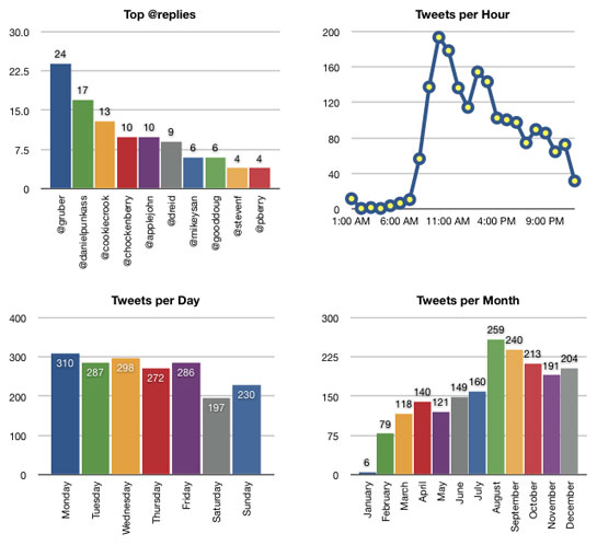
Staring at this year in review for Twitter has given me the following information:
- The @replies aren’t really a surprise, as these are folks I work with or who are avid Twitter buddies. I suspect the interesting data here is in the long tail. How many folks have at least one @reply?
- I’ve been stewing over the lunchtime Twitterspike for a couple of days. In an early version of the stats, there was a spike around 2pm and that spike is still there around Noon in the latest stats. Before seeing either of these graphs, my guess would’ve been that I was chattier in the morning. Looks like I’m apt to fire off a Twitter right after lunch to set the tone for the afternoon.
- The Twitters per month really tell the story of my year: “Getting to know Twitter during the first half of the year, and then August arrives and I’m totally fucking buried with work, which is followed by a couple of months of not wanting to see a computer ever again. December shows up and I’ve got time off, so WHAM… Twitters galore.”
Sadly, the most interesting information isn’t included in these charts’n’graphs and that’s influence. How many people am I following and how many do they follow? How many folks have been following me? Who do I know that they know? It’s the intersections of my Twitter network that I really care about because that is how I can figure out how efficiently collecting and distributing the really juicy information.
Happy New Year.


“For me, I’ve achieved a Twitter equilibrium following roughly 100 people.” Watch it you’re on 117 now 😉
Too many damned interesting people out there.
I think the data you’ve compiled is very interesting indeed. A few people not in the nerd realm are asking me about Twitter and what it can do. They are in politics, and I’m pretty sure that it can have as big an impact on that realm as well. After all, most sound bites fit in 140 characters.
This reminds me of when I started using statcounter. I got so sucked into the charts and graphs that I began to view actual blogging as a stick to poke the numbers with.
I can follow no ore than 8 people before the twittering becomes noise.
Danger! Danger! The more people you follow, the less useful Twitter becomes and the more it incites naysayers to catalog it in the same venue as MySpace.
@MXRK, blogging for the sake of seeing what search queries bring people to your blog can be very rewarding.
I need to get my Twitter stats; Flickr became twice as much fun after they started offering stats.
I see you updated your charts using the new version of the stats script. With the new data, it seems like when you got “totally fucking buried with work” in August you actually dramatically ramped up your tweeting. Goof off online much? 😉
There’s an important lesson here. Be absolutely sure your data is correct, and watch out for hasty conclusions drawn from incorrect or incomplete data. It’s all too easy to twist the facts to explain anything.
Curiously enough, your two usage spikes at roughly 10 AM and 2 PM correlate with the two busiest hours for PSTN telephone traffic during the day. It would be interesting to see whether your tweets during those hours are more business-related than your tweets during other hours.
Numbers never lie.
It has become close to obsession to search the raw data of percentages and such in newspapers. Journalists never know how to interpret data and are unable to calculate even the most simple percentage calculations. You see enormous mistakes in numbers in that very newspaper you have next to your desk right now.
For example, I read a while ago when they were planning to ban smoking in bars in Finland. I calculated all the numbers they gave in the news article and noticed with the data they presented it would mean that yearly about 0,5% of smokers die because of the smoke and 1% of non-smokers. So it’s twice as dangerous not to smoke in a bar if other people smoke?
Better to count it yourself.