Hands up if you use Dashboard on Mac OS X. I said hands up. Hello?
As for me, I installed Mac OS X Lion, discovered where they shoved Dashboard, and immediately turned it off. Good riddance.
Like iChat AV before it, Dashboard was one of those features in Mac OS X that I loved to demo. Check… this out. Boom. And then I never used it again. An informal hallway poll of co-workers regarding Dashboard revealed a consistent answer: “It was cool, but I never really found a use for it. There was never a killer Dashboard widget.”
The story of why I’m not using Dashboard is a good one. It’s a tale that demonstrates an important point about Apple design philosophy and another regarding desktop productivity. At the intersection of these two stories is why Dashboard is delectable eye candy that made no sense.
Three Desktops
If you happen to be sitting at your desk, look around it a bit. If you’re reading this article on a train, imagine what your desk at home looks like. How many layers comprise your desktop?
Duh, one.
There’re really two. There’s the immutable layer that we’ll call the Desktop layer, and then there’s the layer above it where you put all your stuff that we’ll call the Stuff Layer. This pedantic detail is important when we look at the desktop on your computer. How many layers are there? In Mac OS X, I’d suggest there are pretty clearly three. Let’s explore each:

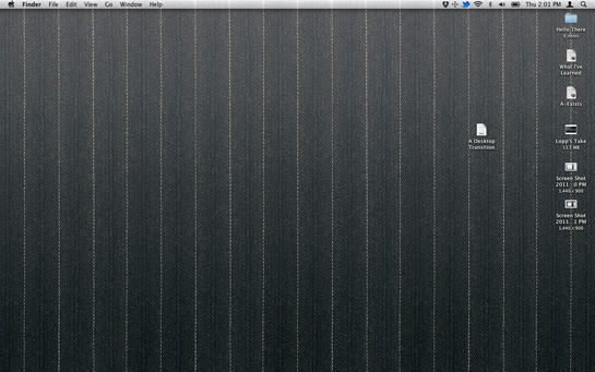
Desktop is your first layer, and unlike your physical desktop, it’s mutable. You can change the picture, and, more importantly, in Mac OS X, your icons, Dock, and menu bar are a comforting fixed, but customizable, part of the layer. More on this point in a moment.

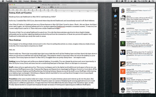
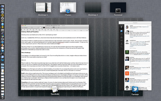
Stuff is where all your applications live. This is your workspace and in the digital world additional working space is free so you can have as many Stuff layers as you like. Features like Exposé and Spaces (now repackaged as Mission Control in Lion) show off the difference between Desktop and Stuff perfectly. Switching between Spaces moves all the stuff in your Stuff layer while leaving your desktop layer unchanged. Switching on Exposé (which has also been morphed into Mission Control) demonstrates the last important layer…

Transition, as the name implies, really isn’t a layer; it’s more of a place between places.
Exposé debuted in Panther and showed off the Transition layer as a means of displaying all running applications so you could easily jump to a different application or window. I’d argue that Cmd-Tab does effectively the same thing in the Transition layer as well. Finally, Spaces landed in Leopard and employs this intermediary layer as means of viewing and organizing your different Stuff layers. Still with me?
Back to Dashboard and why it never worked for me. Given my layer definitions, where does Dashboard belong? The issue with Dashboard is that it’s stuff shoved into a layer that my brain sees as transitional and temporary. Yes, Dashboard widgets were designed to provide lightweight and at-a-glance information. No one is suggesting you’d use a widget to build something useful… in fact, no one builds anything in a widget because when you fire up Dashboard your brain isn’t thinking “What are we about to learn or build?” It’s thinking, “Where are we going now?”
You Know How Things Work
Apple design is meant to invoke reality – they build software to look and feel like how things work in the world around you. As you stare at your virtual desktop, the more it maps to the actual desk you are sitting at right now, the less you’ll think about the fact that you’re staring at a wall of ones and zeros and focus on the task at hand.
This is why much Exposé has been lobotomized in Lion. How would you react if, whenever you were wondering where something was on your desktop, I’d show up, pull every single thing off it and show it to you in a manner completely different from how you organized it?
You’d yell, “Don’t touch my stuff!” because in an instant you’d realize how much organization was hidden inside your disorganization.
Dashboard is old news. No one is talking about Dashboard; they’re wondering why design metaphors for iOS — a mobile OS — are being shoved back into Mac OS X — a desktop OS. Now that you understand how I see my desktop, next I’ll explain why Apple’s mobile concept belongs in desktop world, why they make for productive window management, and, finally, why I love the ass-backward feature called natural scrolling.
I understand the Pages and Word combination, but Mail and Outlook?
/me raises hand.
I use several widgets on my dashboard every day.
I use Dashboard, and don’t have a problem with the strange metaphor at all. I have always thought of it as something like a drawer in the desk or a sheet of paper tacked up on the wall – out of the way of my normal work, but instantly available whenever I need the stuff on it.
For reference, I use it for a specific set of things that I want instant-access to but don’t want to always have “on my desk” – calculator, calendar, weather, and load monitor. In the case of the calculator and the load monitor, I specifically want them to be visible over top of my normal windows, so I can see whatever window it is that prompted me to pull them out.
On the other hand, the new Dashboard arrangement in Lion (i.e. as a new space, off to the left) actually fits your metaphor pretty well – it’s just area on your desk, that maybe you don’t go to very often. (Still, though, I want it to be instantly available, so I switched it back to the old way.)
/me raises hand on Dashboard too.
Weather, stocks, calendar, and package tracking were all killer “I want to know this in under 5 seconds without a lot of thought” uses for me.
Many of these notifiers are now living in my browser, next to the URL bar. But having those always possibly stealing mental focus is bad – these are things I want as pull notifications, not push. And I don’t want to use my mouse.
I hit F12 a lot every day, and so this change is going to take a while for me to get used to. But maybe that is the right metaphor – maybe the new Dashboard screen is similar to putting something on a wall next to my desk. It’s a glance to my right to see a calendar, or a glance to a window mounted thermometer.
wow. OVERTHINKING IT!
dashboard: push a button and get a customizable group of handy widgets. push the button again and they go away.
this is hard?
i use mine all the time.
/me Another raised hand.
Like Matt, I use it for “I need it right now” ad hoc information. Specifically I use the Thesaurus, Converter, Translator, Calculator and 4 world clocks: 3 for clients, 1 set to Cupertino. Doesn’t *every* Machead have one of those?
Furthermore, I have the developer mode enabled so that I can “hold” the calculator while coming out of Dashboard and have it over the top of my regular work windows, usually when I’m working out some pixel dimensions in Photoshop.
The article was a little hard to follow for me because I dont use a mac. I have many of these features in my current desktop, but the mismatched vocabulary was difficult. linking to outside resources or more pics would be helped.
As an aside, I use the keyboard shortcuts way more. [super + spacebar] is much faster and easier than finding your pointer, navigating to an icon to launch dashboard, and then finding the icon that you want to launch. since both of these do the same thing, you might not see a need for dashboard because you use the alternative. remember the reverse is also true for those people who use dashboard and not the shortcuts.
The Matt above is a different occurrence than the first one.
/me
I use my Dashboard. I use the calculator, and web clips of comics. But the thing that I use most is the weather. A quick glance before going outside will tell me if the weather is about the same as yesterday, and if I should grab a jacket for later in the day.
This is why much Exposé has been lobotomized in Lion. How would you react if, whenever you were wondering where something was on your desktop, I’d show up, pull every single thing off it and show it to you in a manner completely different from how you organized it?
Mission Control is next to impossible to use. You can no longer Exposé 5 Finder windows because Mission Control groups them all too closely together to click. Is adding time-consuming clicks to my workflow something beneficial that Apple has mapped over from a real desktop? I’m sure lots of people like Mission Control but it’s removed a lot of the useful functionality from Exposé. Hmmm… reminds me of Final Cut Pro X…
I’m curious to see how Launchpad fits into the skeuomorphic desktop metaphor. I think Launchpad is a pretty blatant example of Apple dumbing down OS X by adding needless iOS crap. If there were a hack to disable Launchpad, I’d do it in a heartbeat.
*another raised hand*
I don’t use it often, but when I do, it’s for quick information. A simple pull-up and throw-away. And it’s gotten faster to do that in Lion as well.
I also want to say I’ve been very happy with Mission Control as well.
/me raises hand (I actually raised my hand when I first read it)
I use the calculator, an envelope printing widget, and a Simplenote list in addition to the usual weather, calendar, etc.
I like the fact that I can swipe to the right now, rather than remember which key invoked Dashboard as before.
I use Dashboard all the time to check the date (yes, at least once a day!), and then check the time for my collaborators around the world. But I know only a small fraction of people do use it, and mostly for very basic things. A status item in the menu bar would probably work as well.
I think the analogy to having things in the wall in front of you, or in a drawer, is good.
Was initially distraught following the move from spaces to mission control desktops, but really like how now I can peek into the next desktop (IRC and adium) while staying in the current desktop.
I use Dashboard to look up dates on the calendar, and to see the weather forecast and weather radar with a flick of the wrist. Luckily it’s still an option, though I did change the setting in Lion so that it would appear over my desktop, rather than bringing up its own background.
I didn’t even realised people used OSX… I know so many people who went Apple for about 6 months and ended up ditching it… because… it’s… well… crap…
I just upgraded to Lion after getting assurances that my “must-run” apps wouldn’t break after the upgrade.
Dashboard, for me as well as for many of the people here who’ve admitted to using it, as a quick way to look at two or three reflexive bits of information.
I will admit that the first two weeks I’d used Dashboard, I’d done endless screwing with it and downloading widgets and optimizing every last bit of real estate to get a maximum number of widgets. When you called up Dashboard at that point, my monitor looked like a Colorforms set threw up on it. After that though, I just stopped. It wasn’t particularly useful to have all that information up there, and then it became my fast way of looking at the weather before I hopped out the door.
Count another vote for those who use Dashboard every day. Delivery Status is a killer widget, and the Mint widgets for quick glances at stats are awesome too. I disagree that Dashboard is a difficult concept to grasp at all. I think that people just like to jump on the Dashboard-bashing bandwagon because they’ve not found that killer widget that works for them. I do agree with the rest of the article though, in regards to the desktop metaphor.
Let’s be blunt: Dashboard was an abortion because Apple wasn’t smart enough (or fast enough, or diplomatic enough; lord knows what the actual issue was) to buy Konfabulator before Yahoo did. So they threw together a half-assed copy with a crippled UI metaphor that was different from Konfab primarily as a means of heading off the otherwise inevitable lawsuits. Shockingly, a critical mass of user and developer interest never managed to congeal around the product that emerged from such an, um, enlightened development process.
Of course the saddest part of the whole story was that Yahoo, being Yahoo, managed to crush the life out of Konfab as a product, so instead where there was once a single, popular widget platform on OSX there are now two failed ones. So that’s nice.
Hand up.
Always up on edge of one of three screens:
– Dictionary (far better result and faster than Googling)
– Weather
– iStat Pro
But I’m waiting for the redo of the Mac Pro and like many windows while hating single-mode apps.’
I also don’t like having all my private data on public clouds. Drop Box is convenient, as are many other “free” services, but I’m going to try out Toredo to get my calendar and private files under my own management.
Given that moving directly to Lion from Leopard is troublesome (running G5-based Pro), maybe I’m drifting away from the Mac Scene and soon to become a Linux Luddite.
The new UI may be great for expanding business, but it might lose the computing vanguard that loved the mix of real Unix and a nice UI—but not dumbed down—on the side.
Twenty-plus comments, lots from folks who use Dashboard for quick information access, and no one has yet mentioned the sports scores.
A scoreboard widget (I use “Sports Fan”) is the only thing for which I use Dashboard more than monthly. (And I use it very frequently once we get to football/ basketball/ hockey season.)
@GaffaTapeLol Or her Facebook website.
I use Dashboard for two things:
1. ) Eight World Clocks to cover the different time zones I have to interact with
2.) Quick access to just enough of a Calculator like I used to have on Classic by dropping into Macsbug.
Everything else about Dashboard turned out to be novelty for me.
/me raises hand
I use Dashboard throughout the course of the day. Why? Because Dashboard provides me with “just in time” information:
I want to know what the weather radar is *right now*, not after I go to OmniWeb, open another tab, click on a bookmark, and wait for it to load.
I want to know where my package is *right now*, not after I go to Mail, search through my “web orders” folder for the confirmation email, click the link, and wait for FedEx’s page to load.
I want to check on my wife’s flight *right now* to see if she’ll be landing on time or not.
Etc, etc, etc.
I think Dashboard is great because it gives you “just in time” information *right now*… then gets the hell out of your way and let’s you get back to the task at hand. Just like, well, a car’s dashboard.