I remain steadfast in my belief that one of the best examples of the disproportionate value of the iPhone is the fact that we are able to completely ignore the fact that its form factor is horrible to use as a camera. Yes, the internals are amazing, the guts of the camera are terrific, but when you’re awkwardly holding it out, taking pictures with this device, admit it, you’re always 22% certain the thing is going to pop out of the delicate cradle of fingers that you’ve constructed to hold it.
And I eagerly take photos with my iPhone every single day.
It is with equal irony that the app I need the most to post my photos is the one I use the least – Instagram. Now, I love Instagram and there is no denying that the team hit on a pitch perfect combination of the right, minimal feature set during a critical rise of mobile phone operating systems. But the majority of my learning about how to take and edit photographs with my iPhone has occurred outside of Instagram where I figured out how to be a better storyteller.
Here’s what I’ve learned and how I’ve learned it:
Find your edit. The initial attraction of Instagram is one-stop shopping. The application does represent a complete solution for capturing, editing, and posting a photo. Instagram found a sweet spot for the core set of essential tools, and much of my early photography with it was spent exploring what I could capture in a square photograph and how that capture might interact with Instagram’s clever spectrum of filters.
There is a special pride that comes from taking and posting a photograph that you feel needs no editing – when you’ve found that perfect combination of composition and color. But in my experience, the majority of photographs will benefit from some type of editing. I came to this realization with my beloved Gotham filter in Instagram, which did something absolutely magical with blue skies and clouds. Gotham instantly transformed a bland horizon shot into something that appeared to be from another planet.
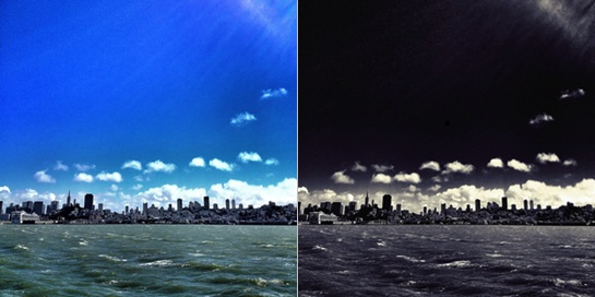
For reasons I still don’t understand, Instagram removed Gotham from the 2.0 release. Infuriated, I took to the Internet to understand how this filter I loved was constructed. Turns out, it’s a non-trivial process outside of Instagram, which originally involved three different applications. The Gotham reconstruction process not only returned an approximation of my favorite filter, it showed me what decent amount of work Instagram did in order to find a set of compelling filters. More importantly, though, I learned that with equal work, I could build any filter I wanted.
You can hang out exclusively in Instagram, but my advice is to figure out how to recreate your favorite filter in other applications, such as Camera+ or Snapseed, because in doing so, you’ll discover there are infinite filters at your disposal.
Light is only useful if you can see it. Or its absence. My next discovery has to do with lighting. In flying back and forth between the west and east I discovered I had a cloud problem. I couldn’t stop taking pictures of clouds, but I also discovered there were optimal times to capture their shape and texture: sunrise and sunset.
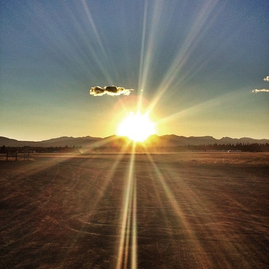
What’s going on the during these two distinct times of day? First, there are more yellows, oranges, and reds in the sky as the sun refracts out more of the light spectrum, but more importantly, there are shadows. You’re going to read more about my fascination with contrast in a bit, but what is magical about sunrise and sunset is the strange black shapes that slowly stretch across the landscape. Objects you stare at every day are framed by oddly twisted and stretched shadows of themselves and it’s these mutated mirror images that capture my eye.
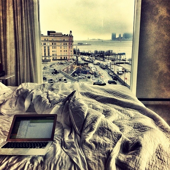
It’s instinct for me now. When the sun is either rising or setting, I look where it is in the sky and and I look in two directions: directly at the sun to see what it’s playing with:
And then I look around to see what other shadows it’s created:
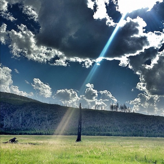
I prefer contrast and drama. My standard editing process starts in Snapseed. I use “Tune Image” to adjust brightness, ambiance, contrast, and saturation. I rarely touch white balance. As you can see, I have a fascination with high contrast and deeply saturated photos. My wife does not and I wonder if that makes her a better casual photographer than I, but then I stop wondering because such mental excursions are a waste of energy.
While feedback from likes or comments are one of my favorite ways to get a sense of how folks feel about a photo, and while I love to see what other folks are building on Instagram, the joy of a great photograph is that it speaks to you. I love finding circles, deep perspective, vibrant colors, and contrast everywhere. This is why my last move in Snapseed is to try the Drama filter. This unique filter performs some crazy HDR transformation that finds unexpected depth in clouds, carves out deep shadows, and adds texture everywhere. Drama often takes my breath away.
Black and white strips away color and reveals unexpected stories. I’m just back from a family vacation in Costa Rica and if Costa Rica were to nominate a national color that color would be green. In the areas we traveled, the average rainfall ranged from 80 to 200 inches a year and that means green everywhere. Given my preference for deeply saturated colors, you’d expect lots of jungle, and Costa Rica didn’t disappoint, but my favorite jungle shot didn’t have a smidge of green.
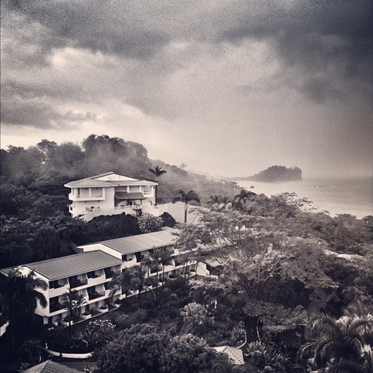
A lesson I learned in my reverse engineering of the Gotham filter was the strange power of black and white filters. The removal of color allows other elements of the photo to emerge. The haziness of the rainy sky. The pleasing geometry of buildings. The perspective afforded by fog. The original image is a blast of greens and reds and would’ve shown little of what I just described. The lesson of black and white photos is similar to the lesson of Instagram: what you remove, how you reduce, may allow previously hidden simplicity to appear.
My process for black and white varies, but the approximation of Gotham starts in Snapseed, where I perform the same image tuning as I described above. I follow that up with applying the red, black and white filter before I jump over to Camera+. In this app, I do the following:
- Select the Darken filter.
- Apply the Silver Gelatin filter at 50%. Apply changes.
- Apply the Vibrant filter at 25%. Apply changes.
- Lastly, apply the Cyanotype filter at ~10%. Apply changes.
Instant gorgeous Gotham. R.I.P.
People lose their shit for fog. Or, maybe, there is nothing negative about negative space. My last learning has to do with disproportionate value. There are a couple of semi-guaranteed moves that generate good photos and I think they relate to this article’s theme.
First, if you want a reaction from your audience, I recommend fog. Like… any fog. I can rarely predict the audience reaction to my photos, but I know that fog is a crowd pleaser. I know this because one of my first well-received photographs, I believe, is only magical because of the fog that provided an otherwise unattainable Middle Earth quality.
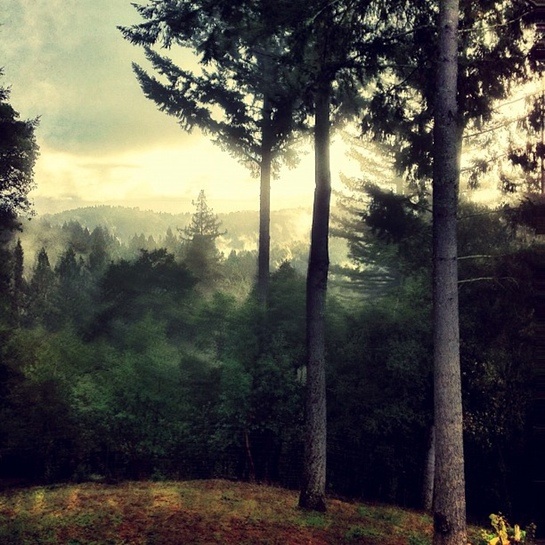
Second, and similarly, I want to note the power of negative space. My gut instinct is to fill the photographic frame up with stuff, and that’s precisely the opposite of what your eye wants to see. If you go back and look at my photo history, you’ll notice I have a real problem with horizons and clouds – I can’t stop taking pictures of them. However, you might also notice that the amount of horizon I capture is slowly decreasing. Negative space is the space around and between the subject(s) of an image, and what I’ve discovered after several thousand Instagrams is that the more negative space I place in a photo, the more story it tells.
Find a Story
A good picture tells a complete story. There is a beginning, a middle and an end. Unlike an actual written story, the words are captured in objects, color, light and arrangement. But the combination of each of these aspects is only half the story. The other half is provided by the viewer. It’s the story they tell themselves as they process the image in a way that is entirely unique to them.
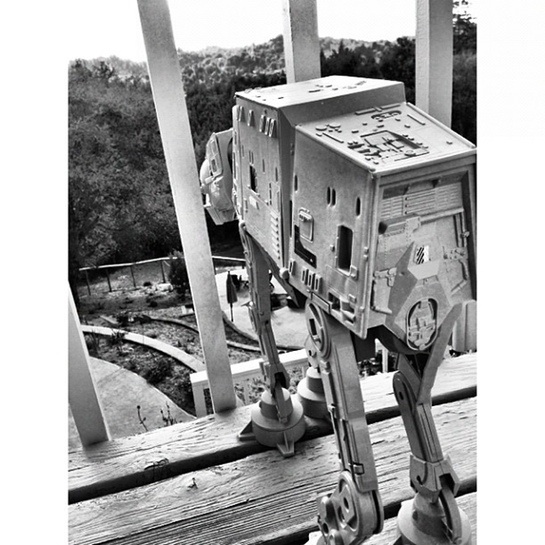
My belief is that good photography involves the same process as good application and hardware design. You find the essence of what you are photographing, writing, or building and that means you need to be willing to strip away the unnecessary over and over again. In a world where we love to preserve our options, reduction feels limiting, but sensible reduction allows the consumers of the work to better tell their own story.

I don’t get it. First you talk about how simple that app is. Then you go on to detail how you make it complicated. Here are my recommended steps.
1. Open Instagram
2. Take a photo
3. Apply filter (optional), post
A good photo shines by itself.
Hey, Charles, if that works for you, great.
I agree though that generally you can improve an image with some level of work. Sometimes you can even make a memorable image from a non-memorable one.
To me this is no different than picking the approprate film, filter or taking time to choose your framing for that matter.
Shane,
I don’t want to imply I’m against processing. I do quite a bit in Lightroom… etc on the computer and I even edit on the iPhone/iPad quite a bit.
For me, when I see non-square photos, photos from a DSLR, photos edited far beyond what Instagram can do it disturbs my Instagram flow as I scroll though photos. I have other outlets where I display or view those types of work and I think they are better suited for it than Instagram.
I guess I am a bit of an Instagram purist. I don’t want to imply everyone has to use Instagram the way I suggest, but I’ve made the choice not to follow those types. Put them up on G+ or Flickr where you can show off your individual processing style more and I can see them in larger sizes to appreciate them.
I agree with your comments on negative space and fog. Nothing pleases the Instagram audience more, unless it’s puppies or One Direction.
But, I find black and white photography on Instagram is mostly boring. The images you included in this post are pretty, but the majority of people who use black and white don’t seem to understand how to use it. I am not a photog, so I even I don’t understand the usage of black and white. I just know what I personally find visually pleasing.
Great Post.
Have you ever tried using an app like Pro HDR? It goes beyond what the iPhone’s built-in HDR can achieve and even if you end up desaturating it and putting it through a lot of filters, you’ll be starting out with more dynamic range and better colors.
yup, filters. making terrible photos ‘interesting’ since the 1950s.
I agree with Charles.
I *personally* hate it when I see pictures in my feed that were not shot with a mobile phone (e.g. an SLR).
While this piece isn’t recommending people to take pictures with an SLR, it is recommending that they use 3rd party apps to post-process images before feeding them into Instagram. A Camera+ filter is akin to an Instagram filter so maybe it’s not a big deal. However, it’s more about the frame of mind. If you’re spending a lot of time perfecting an image before posting it on Instagram, it’s not so “instant” anymore..
It would be like brainstorming and meticulously drafting a Tweet. It’s okay, but I *personally* prefer reading Tweets that are have a more reflexive frame of mind. Same with Instagram.
Question: When you say you use a filter and apply changes in Camera+, then add a second and third filter to the image, have you discovered a way to add up these filters on an image without saving to the camera roll each time and re-importing the photo?
I love Camera+ and use it often, and I’ve also often wished I could stack up the various filters on an image without saving/reimporting each time. I would love to learn if there’s this feature in there and I’ve stupidly missed it all this time.
I wish I still had the originals.
The original images that is, not the filtered versions.
Ballookey: If you tap and hold on “Save,” you should find an option called “Commit Edits.” Then you can go in and edit the edited image.
I love this post, the advice on the process of making a photo is perfect. I love the photos too.
One request though. You said: “…as the sun *refracts* out more of the light spectrum…” (emphasis mine). I’d prefer you say *scatters* instead. It just makes it easier for people to search for more information on the physical phenomenon if they want.
This was a seriously well written piece. Thanks!
THANK YOU so much SJ Austin!!! Life improved a tiny bit!
Your section titled “Black and white strips away color and reveals unexpected stories” is simplified and summarized by my favorite Jay Maisel quote:
“Color is the Enemy of Shape”.
When you have an image with interesting shape or textures, removing color lets you see the shapes and textures with more clarity.
It only just occurred to me that the vast majority of Instagram users probably haven’t ever used Photoshop. No wonder it seems like magic…
You have an excellent eye, so the originals would have stood well alone, but I really like how you’ve treated them. It’s not often I see photography that I really enjoy.
Hi i’m not seeing the red,white and black filters you speak of.
Can you clarify? Thanks!
“My process for black and white varies, but the approximation of Gotham starts in Snapseed, where I perform the same image tuning as I described above. I follow that up with applying the red, black and white filter before I jump over to Camera+. In this app, I do the following:
What you’re describing perfectly fits with what we’ve built at Backspaces. Give it a whirl: http://backspac.es
We’ve shot up to the top 10 of Photo & Video in the App Store with 30k users coming over from Instagram yesterday.
We’re about creating stories with your photos.
Let me know what you think!
Adrian
I would like to point your attention on this App: Photam
Photam is a photo-effect iPhone App that revamps the old Gotham filter by Instagram. The app provides additional features built around the «missing» filter: photam-feed, camera-filter and “serendipity” (Photam user of the day). A refined design we’re proud of and deep integration with Instagram APIs.
Launched on the App Store on May 2013. You can get it at http://www.phot.am or watch the #photamfeed collected on our Tumblr http://photam.tumblr.com/
Howdy! Would you mind if I share your blog with my myspace group? There’s a lot of people that I think would really appreciate your content. Please let me know. Thank you