For a word that can so vastly change the fortunes of a company, it’s worth noting that no generally accepted definition of the word design exists. This means when your boss stands up in front of the team at that all-hands and says, “We’ll have a design-centered culture,” there’s a good chance he’s saying nothing at all.
But you keep hearing this word. More importantly, you hear the urgency behind the word. You hear that choosing to design a thing is an important thing to do and the person saying it is also important, so you nod vigorously while silently thinking, “I have no fucking idea what you’re talking about and I’m pretty sure neither do you.”
There is no more evidence required that a magical focus on design can transform a company. In order for this to happen, engineering and design need to party more together, but there’s a fundamental tension between design and engineering and understanding that tension is a good place to start thinking about design.
A Fundamental Tension
To understand the historic tension between the designer and the engineer, you need to go back to when software became mainstream, and in my mind that was with the arrival of the Internet. Software had been around and making piles of money long before Netscape, but it became a worldwide phenomenal when anyone, anywhere could mail anyone else a picture of their cat.
The arrival of everyone (and their cats) presented a challenge to these early software development teams. These teams were used to working with early adopters and their particular needs. See, early adopters are willing to put up with a lot of crap — it’s part of the deal we have with them. “You get to play with the latest and greatest, but it may explode at any point.” Early adopters are cool with these explosions because early adoption makes them feel, well, cool.
When everyone arrived, everyone didn’t want explosions — they just wanted it to work. Engineers hear “just works” as “they want fewer explosions”, but that’s not what everyone wanted. They wanted to send a picture of their cat in the simplest way possible. They didn’t care about JavaScript, security, frames or plugins; they just wanted to mail a picture of their goddamned cat without the application exploding.
Design results in the tangible translation between engineering thought: “fewer explosions” and user thought: “reliable, one-click cat photo mailing”. Good design manages to both showcase the best of engineering efforts while simultaneously hiding them from the user.
After working with a wide of variety of designers, my opinion is that the role of design is:
- Understanding what most users want.
- Prioritizing and focusing on the most important of those wants.
- Using this knowledge to exceed user expectations.
In the mid 90s, we, as traditional engineers, were not equipped for the role I described above. We’d been trained as builders of bits, and we believed that because we could build bits that we could build usable bits, but we were actually good at designing good product for ourselves… not everyone.
We don’t see an explosion as a bad thing because we’re intimately aware of how the sausage is made. We know that when a program crashes, you just re-launch the application and get back to work. Most humans on the planet do not see a crashed application this way. They are, at the very least, alarmed when something explodes. They’re wondering, “Did permanent damage just occur?”
A Note to the Designer and the Engineer
With apologies to the incredible menagerie of design folk out there, this primer primarily focuses on the design denizens and design practices that surround software development. Furthermore, this primer is being written by an engineer for engineers. While I’ve spent a good many years soaking in design, I’m not a trained designer and the following descriptions of your history and your craft will piss you off with their simplicity, imprecision, incompleteness, and engineering bias.
But we’re doing the same thing to design folk. We are well intentioned, but because we haven’t repeatedly experienced the essential details, we are ignorant of them. We assume the act of describing the work somehow is equivalent to doing the work and, wow, are we wrong, but we are in good company because every eager master of their respective craft does this.
Engineers are uncomfortable with ignorance, but worse, we’re bad at asking for help outside of our domain of expertise. This primer is the first step at building a solid bridge between our professions. So, chill. This is not a definitive design guide, it’s a place for engineers to start thinking about design and if you happen to learn something about how we think — super.
The Acronyms Matter
The phrase “we need a designer” is likely the first time you’ll hear about design as a freshly minted software engineer. You wonder, “Well, what are they going to do that I’m not already doing?” The answer is an impressively long list of work that is beyond the scope of this article, but a good place to start is three key acronyms.
Like any profession, design is chock full of acronyms, but I’m going to focus on the three that are going be bandied about now that your boss has decided that design matters.
#1 GD — Graphic Design
How they see the world:

Unfortunately, the most common name used to describe the graphic designer is, confusingly, the designer. The reasons are two-fold: first, he was the first person hired to work on the product who had any skill set outside of engineering, and second, he was placed in charge of the “the pretty”. Someone in charge saw the first working prototype of the product and said, “This looks like an engineer threw it together”, (you nod) and “We need a designer to fix this up” (blank stare).
You: “Fix what up?”
Person in charge: “I don’t know… it just needs to… look prettier.”
Designers who have not yet bolted from this article, yet, are now standing on their chairs screaming at the screen as they read this: “I KNOW THAT GUY.”
Yeah, I know him, too. He’s an idiot, but he has good intentions.
The craft of the graphic designer is a visual one. Via applications like Photoshop and Illustrator, a graphic designer gives visual form to ideas. Yes, the work they do is pretty, but it isn’t just pretty. It speaks. It has an opinion about what it is and anyone who looks at it can see the opinion. Yes, a designer gives your application or website an air of clean, credible professionalism, but a well drawn anything does little to make your product easier to use.
A breakdown occurs when the person in charge walks into the graphic designer’s office and says, “You’re the designer — can you help de-engineer the product?” Now, like you, the graphic designer wants to do more — they want more responsibility — so even though they don’t know how the product works or who your users are, they sign up, thinking, “Sure, I’m a designer, right?”
And they produce. They generate an eye-pleasing prototype in Photoshop that you just want to lick. The graphic designer has done something most engineers cannot, and while important design work has occurred, the design is not remotely done — your product simply has a pretty face. And while it does matter how your product looks, it’s equally important how it works.
For the end of each section of this primer, I’ve selected a set of three design-related books that have shaped my design opinion. Let’s start with design essentials:
#2 IxD — Interaction Design
How IxD sees the world:
The interaction designer has a fascinating gig: they abstract function from form. Think of how you regularly navigate your favorite application. You follow a familiar path that we’ll call a workflow: it’s a series of mouse clicks and drags accompanied by your rapid-fire keyboard wizardry. This is your interface with the application.
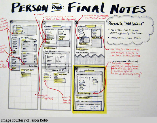
The interaction designer’s gig is the care and the feeding of the workflow. Via the deft usage of wireframes and flowcharts, the interaction designer defines and refines the step-by-step process by which a user can traverse the application.
These low fidelity descriptions of the functionality are confusing to those who don’t understand their intent. Is this how the application is going to look? No, this is the interaction. These are rough approximations of the user interface intended to describe how it will work, not how it will look. But how is it going to look? Could we get drop shadows on that text? I love drop shadows and blue, I love words with a punch. Yeah, ok, right — you need to leave now. The door is down the hall on the left and it’s a lovely shade of blue.
The separation of function from form involves making a mental leap and there are those who believe one cannot be considered without the other. I believe the answer is somewhere in the middle. While I don’t believe you need pixel-perfect comps in order to think strategically about interaction, I do believe working prototypes with sample interaction and animation is a far richer place to have a debate than a whiteboard.
A low-fidelity scribble can describe how your product works, and it does remove many of the subjective elements of design that are apt to derail a perfect good design conversation into a useless debate about drop shadows. But color, typography, spacing — all of these elements contribute to the feel of your product, and how your product feels is equally important to how it works.
There are two other acronyms in close orbit to IxD that you’re likely going to discover that are worth mentioning:
IA or Information Architect is a title falling out of favor in recent years. Perhaps the best model for thinking about IAs is the role of a librarian. The mindset of information architects is what gave us the Dewey Decimal System: a classification system for information. An IA does not sleep well until information has been organized. I haven’t run into one of these folks in a while.
HCI or Human Computer Interaction is another title you’ll discover. It appears this title is one granted exclusively from University and those sporting this title first self-declare their degree, then pause, then add their University. Yes, I have a PhD in HCI <pause> from Carnegie Mellon.
My experience with the HCI folk is that they are often brilliant researchers. If you want to understand every possible workflow your users are trying on your application, the elapsed time to complete these workflows, and the enumerated set of quantified emotional damage these workflows are inflicting on your users, find an HCI guy, give him 18 months, and you’ll be <pause> dazzled.
Continuing with the reading list. These books were selected because I believe they are approachable by anyone. Reading these will not give you a complete design education, they will give you a good solid taste of the different parts of design:
#3 UXD — User Experience Design
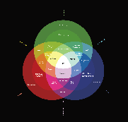
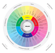
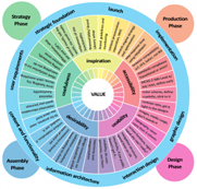
Finding the one image that describes how UxD thinks is tricky, so here are three (click on any for further detail):
User. Experience. Design. What do they care about? Well, you care about the whole damned thing. You care about the visual design; you care about the interaction design; but mostly what you care about is the experience of the user.
In my experience, the folks sporting the UxD title have nothing like a degree in UxD. It’s a title they’ve adopted over the years because they know what I know: the title of designer is too general to be useful. Graphic designer and interaction designer are too specific. The user experience designer likely had an acronym in her past, but somewhere in the journey she decided it was to her advantage to care about the whole damned product.
Awesome.
There are a pile of design disciplines that contribute their acronyms and abilities to product design efforts and there is a time and place for each. The reason I seek the person that labels or thinks of herself as UxD is because I’m looking for a person who is willing to step up and be accountable for the entire experience.
The last part of the reading list includes absolute design classics. Yes, a book about comics:
Party. More. Together.
Usability as a design discipline is conspicuously missing from this list. Thing is, even if it had a clever acronym I wouldn’t include it.
Prior to Steve Jobs’ return to Apple, there was a decent centralized usability team equipped with those fancy rooms with one-way mirrors and video cameras. I’m certain these folks did significant work, but when Jobs returned, he shut it down and he cast the design teams to the wind. Each product team inherited part of the former usability team.
Now, I arrived after this reorganization occurred, so I don’t know the actual reasoning, but I do know I never saw those usability labs used once and I would argue that in the past decade Apple has created some of the most usable products out there. My opinion is that the choice to spread the usability design function across the engineering team was intended to send a clear message: engineer and designer need to party more… together.
I can’t imagine building a team responsible for consumer products where engineers and designers weren’t constantly meddling in each other’s business. Yes, they often argue from completely opposite sides of the brain. Yes, it is often a battle of art and science, but engineering and design want exactly the same thing. They want the intense satisfaction of knowing they successfully built something that matters.
A design-centered culture is at throwaway empty phrase unless everyone responsible for the culture of design is in each other’s faces. Titles and acronyms give you a starting point for understanding what a person might do, but what really matters is the respect that comes when you take the time to understand how they build what they love.
Knowledge of wants is the stuff of focus groups. The result is the Edsel.
Understanding of needs is the stuff of Apple. The result is the iPad.
1. Understanding what most users NEED.
2. Prioritizing and focusing on the most important of those NEEDS.
3. Using this UNDERSTANDING to exceed user expectations.
However, many UXD people don’t have any IxD credentials, training, or even a modicum of sense in that arena. Since they have nothing back them up, they get all handwavy many times when they try to pretend to be more than a GD, even when the programming staff has more IxD training and experience than they do.
They make buttons too small (on iOS), insist on non-standard solutions to problems in strange places, and several other things of that nature.
For a young field, UXD as you call it, is full of fakers currently.
…”I would argue that in the past decade Apple has created some of the most usable products out there.”
Which is why my MacBook Pro, as “magical” a piece of hardware that it is, threatens to slit my wrists if I dare attempt a task such as typing without perfect posture? Silly mortal…
Hubris, in design or engineering, is a poor substitute for caring about how customers will use your product.
Thank you for this great article. Deserves expansion.
I’m dislike the various connotations that accompany the term “User Experience Design”. I think it pretends to power that no one has. I wish the term for designing a whole application was simply “application design”. An application is an artifact, and it is designed. The experience comes after.
I am not saying that the application doesn’t affect the experience, or even that it might be the core of the experience. But usually, the experience is predominantly determined by the data/information (in producer/consumer apps), the other people (in communications apps) or the device (in tools and control apps).
What I would certainly agree with is that a poorly designed application can create a terrible experience, and a well designed one is a necessary, if not sufficient, condition for a positive experience. Necessary, but not sufficient.
Thank you for this article. This will be a real help for my students in my new module on Advanced Interactive Technologies. I cover HCI, UX, Interaction Design and the pointers and links you have are very valuable.
fantastic article. thanks.
@Michael. You do have a point, however, there are plenty of UX designers and architects out there with a wealth of experience in many fields and good instinctive, reactive insights do come from many years of experience. I work in a team where each individual has at least ten years experience and it does show in their work. Let’s hope you get to work with a good one.
Great article. But like Joseph above, I’d be a bit wary with drawing conclusions from Apple regarding usability.
I definitely agree with the final point, that developers and designers need to work together, and I’d even argue that any company that has to have a separate usability team has problems.
But Apple is clearly a company where developers and designers alike live and breathe their own products, which definitely isn’t the case for other companies – I would say that most err on the side of doing far too little usability work (and I’d have a hard time to separate that from interaction design or UXD) rather than too much.
Jared Spool has a very good presentation about different kinds of design, which is available on Vimeo:
Anatomy of a Design Decision
Great article. Though I would also recommend Raskin’s “The Humane Interface.” If for no other reason than for his description of software interfaces and tools being subsumed into the user’s subconscious wetware.
One critique I have of modern (online) design is the desire to build things end users will consciously notice and compliment. This is sort of at odds with Norman & Raskin’s assertion that a tool should be built to be the extension of the user’s body (or mind.) It’s use should be intuitive and effortless. And most of all, the locus of attention should always be the task at hand, and not the tool.
A discussion on UX affordances is likely outside the scope of this article; but you’ve done a great job distilling 90% of what most non-designers will need to know about design into a concise, readable article. Well played!
Great article. As an engineer – I agree with it.
If I was to disagree, it would be about how you dismissed usability because Apple doesn’t do it. No matter how good the interaction is between design and engineering, you don’t know how good something works until you test it with real humans – not designers and engineers. Having said that, you don’t need fancy cameras and one-way glass to do it. The decentralizing of usability to informal processes at Apple might have occurred, but it’s probably called something else, and it’s undoubtable done internally.
But in the end, I simply don’t believe in magic. Creating great product is hard work, which includes iterating based on critical feedback.
How you get that feedback is up to you.
As a real Engineer (Civil Engineering not Coding) we were taught from day one to incorporate all the many aspects of design such as form, function, ergonomics reliability, options, cost, value, risk management, simplicity, communications, planning, safety, environment, market, laws, politics into all of our designs from day one. It is absorbed into our DNA. We could not become professionally qualified until we could convince our peers that we could be trusted to do all that.
Design is not an add-on to Engineering – the whole lot from day one concept to finished product and support is design. No real Engineer would design a Start Button to close down Windows or provide error messages that gave no useful information but effectively confirmed that the product had failed.
You do seem to be considering Apple design to be perfect here, and it is simply not true. Consider the hideous, useless rubbish that is iCal with it’s focus stealing modal windows that popup on whatever space it feels like. Then theres the fact that my desktop is covered in files labelled “Screenshot – 2011 …. :”. The latter is especially amusing as testing often involves a lot of screenshots.
Great design is one thing, design without testing is pure hubris.
I love the drop shadow in the title. /grin
It’s quite interesting to read from the early archives to current posts – although I’m missing some in the middle still – and to see your development as a writer (not to sound like a snotty lit major, which I was not).
I’m sure you saw (or will see) that NYC is opening a public high school dedicated for software engineering – fabulous – and you should consider offering to give a lecture or two there. I’ve found your work/writing (as someone interested in software engineering, employed by a civil engineer, and with mediocre computer skills compared to the people you know and AMAZING ones compared to the people who live in Mississippi) inspiring or whatever (see, I qualified that because I don’t want to sound like a weirdo) and I think that young people who are interested in becoming software engineers will find your perspective and experience valuable.
Just don’t turn them all into apple idolaters. also /grin.
I’m glad you pulled it apart at the end there I was getting rather worried half way though with the focus on restrictive stereotypes.
A culture isn’t something you can enforce anyway – it’s something that emerges.
Thanks for this article. It is great and it deserves to be expanded.
There is a big ignorance about “a designer” (whatever) can do. Looking at the job offer, it is frequent to find employers looking for Ux designer with a knowledge of programming languages and other very technical skills. Fact is that the ux world is (sigh) plenty of people that say to be UX designers but they are not. Lots of programmers decide to say they are UX designers without any understanding of user side analys and creative technique. So, yes, the ux world is plenty of fakers but it is not a Ux designers’ mistake.
I don’t see this big separation between user experience and interaction design. User experience contribute to IxD.
I like when you say that we need to party more together. I think it is true even if it is hard sometimes. Need more collaboration between designers though (e.g. GD and UX and so on!)
I think you nailed the structure of how designers think about their roles, but I wonder if this article misses the point because it doesn’t extend to talk about the role of design thinking in the engineer’s day to day life. As I understand the various roles, each has significant value to add and “Party. More. Together.” is a great recommendation – but I’m looking for something more prescriptive.
What is the right role for an Engineer? a Product Manager? a _____ Designer? How is that influenced by the product being created? What role do managers have in defining the team interactions that lead to the conflicts this article is looking to solve?
Lastly – a friend of mine wrote a great short book on Interaction Design called Cadence & Slang. Unfortunately there are no longer any print copies available (sold out), but if you’re interested in more thinking on that area it’s worth a look: http://cadence.cc/
Thanks for sharing this post. Your site was the first to come up when looking up designs for primer engineers.
@Todd: Rands was one of the earliest supporters of my book ^_^ But kind words all the same, thanks.
Completely agree with Robert, design is an inherent part of engineering.
Great article. Thanks.
I hate to be That Guy, but abbreviations like “GD” “IA” are iniitialisms, not acronyms.
“I have no fucking idea what you’re talking about and I’m pretty sure neither do you.”
…and this is why I keep coming back. Refreshing to hear the Rands voice cut through the sea of PC.
As a Graphic Designer, It’s nice to see that you didn’t dumb down our craft as “icing on the cake” as it is often referred to. But I do have a bit of an issue with this statement:
“Yes, a designer gives your application or website an air of clean, credible professionalism, but a well drawn anything does little to make your product easier to use.”
Actually, a well (graphically) designed interface does a lot to make your product easier to use. Graphic Designers use design principles like contrast, alignment, repetition, proximity, and hierarchy to help users understand how an interface functions. That certainly effects usability.
So spot on. A good article to forward on to management to actually show what we do!
I think we all focus too much on titles. Many folk who used to call themselves IA’s have retitled themselves as UxD’s. Big woop. There’s three core competencies in the software production process, Technical, Visual and Process,and all of them have to work well together to make a great product.
I have a title (IA), but when I tell people what I do I say “I do process. I look at something and figure out how it is supposed to work, and find the smoothest path”.
Loved this article. Inspired me to blog about it. Heck, inspired me to start a blog.
Shameless link to my blog response (really not sure of the etiquette here, so flaming me will be akin to discussing ethics with Newt Gingrich, but I ask for forgiveness in advance if I trespass):
http://barkgolgafrincham.wordpress.com/2012/02/02/job-description/
I really like this blog post. I like being able to get into designers’ mindset when possible. Now I’m sure the discussion between the person in charge and the engineer was an oversimplification intended to illustrate why engineers need designers. But I find myself somewhat annoyed by it. It’s not that I as an engineer think I have impeccable design skill and don’t need a designer. It’s that the idea that simply having the title “designer” makes someone brilliant at design and that the title “engineer” makes someone completely devoid of design skill. It’s important to make sure that titles reflect reality rather than the other way around.
I’m sure that Michael already understands this, so I wrote a response to complement this piece just so others don’t take his article as license to be an ass: http://jasonmbaker.com/an-engineering-primer-for-designers
“Understanding what most users want.”
nothing could be more important than that. for engineers or designers.
however, in my experience there is a growing elephant in the room: designers and developers are understanding less and less.
imagine you are on the hook to develop a new algebraic equation but your arithmetic skills are weak – what are the chances you’ll develop a correct understanding and, therefore, be capable of developing a viable solution? let me tell you: they are *zero*.
i see this on both sides of the aisle: designers are increasingly out of touch with the deep technical juju required to actually *understand* a technical domain while developers entrench themselves so deeply in technical masturbation (can we compress this more? how can we do automate this?) that they cannot possibly view a project from the user’s perspective even when the screens are 1 inch from their faces.
this kind of talk about mixing people up is great. we support it at my company, but i believe that the real mixing needs to happen inside the designer and the developer’s own head. pairing can certainly help this internal development, but it cannot substitute for it.
designers: you need to understand REST, html5 local storage, and ssh. all of it. that is, unless you are satisfied not understanding the constraints of the domain.
developers: you need to view all your tools and work through the lens of the user: they only care if it works, and works easily. they don’t care about a single thing more so stop following the shiny shiny tools du jour and *use* the code you’re developing like a *user* would.
/endrant
Yet another issue to take into account to buy a organization is to using a attorney. In purchase to make your acquire as secure as possible, it is a massive reward to have your personal attorney all through the entire approach. This not only scares absent anyone who calculatedly misrepresents what they are offering, but it also assures that you receive almost everything that you need to have. Business attorneys, particularly ones with encounter in net business income, previously know what you ought to be getting in terms and conditions of digital and rational property. They can also guarantee that all of the right paperwork and documentation is signed at the time of sale. Even if you never want to pay out a law firm to be at your aspect by way of the whole method, you ought to at least have one search about all of the final paperwork ahead of the transaction is finished.