As appears to be tradition now with the iWork suite of applications, Apple is slowly updating the applications to both address minor issues as well as introduce functionality that was removed in the most recent major update.
As is now custom, I keep the old version of Keynote around to compare and contrast feature set because while Apple’s “What’s New in Keynote” is useful, it often neglects to mention interesting changes to functionality and design.
The headline is: nothing earth-shattering has landed in Keynote 6.2 that is going to affect my presentation design workflow. To determine this, I compared toolbars, preferences, inspectors, and menu bars between Keynote 6.1 and 6.2. It’s not an exhaustive comparison, but this is where I tend to spend my time and any improvement has potential to increase my presentation design joy.
So, yes, the toolbar is updated. Keynote 6.1’s toolbar is on the top, Keynote 6.2 is on the bottom – click to see a larger version:
This adds a button I don’t need – add a slide – because I’m a keyboard guy and Cmd-Shift-N works great. They’ve also changed the Setup “inspector” to Document which makes sense in my head. These palettes remain frustratingly docked in the main window. As I’ve written about before, I’m uncertain if this is usability improvement, but I’m about to enter a presentation heavy lifestyle over the next three months. I’ll have a better sense of the use of these embedded palettes.
Preferences were mostly unchanged. They added the ability to show slide layout names which I have not figured out. I can display ruler units as a percentage. Ok. Great?
Animations received love with the addition of new transitions and builds. They also added motion blur to the animations which is is a slick visual flourish you’ll never actually see, but will appreciate. Magic Move adds text morphing which means it will continue to be one of my go to animations as my presentations tend to be text focused1. Magic Move is still baffling to set-up and remains fragile as it relies on multiple slides to be… just right, but I’m happy to see it’s evolution.
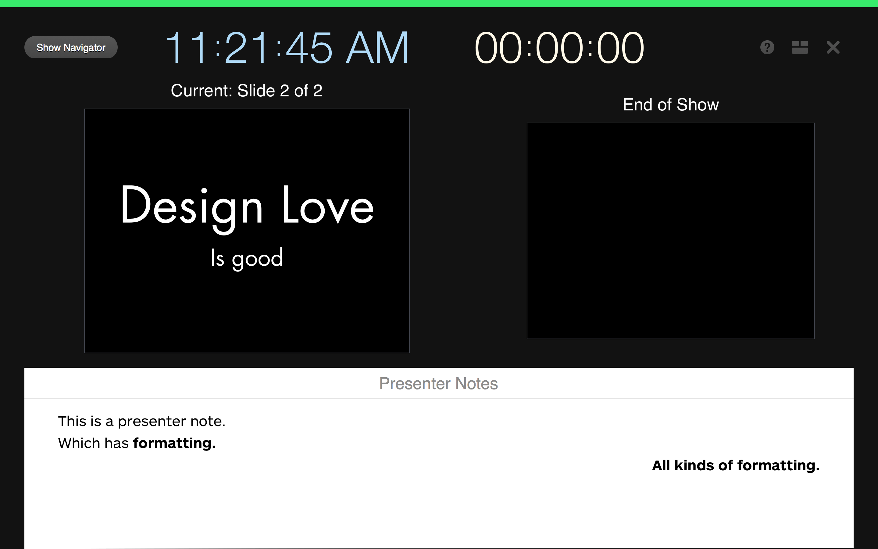
Presentation view, I believe, remains functionally equivalent to the prior version, but did receive design love.
In both practice and play mode2, the presentation view now shows you when you’re ready to proceed with a clear green bar across the top of the view. When an animation is running, this bar is red which is handy. All of the buttons at the top of the window have been increased in size, altered in color, and have better placement to make your presentation practicing easier. Lastly and most importantly, while you still can not perform free form layout of the presentation view, Keynote does allow you to change the style of the presentation notes on a per slide. I’m not sure when this handy feature landed, it wasn’t Keynote 6.2. You still can’t change the presentation notes style at the master slide level which would be convenient and efficient at making sure that presentation notes are optimally sized while in the presenter view.
According to the What’s New update provided by Apple, there are many other new features: Alpha image editing, media browser improvements, custom data formats, improved AppleScript support, support for animated GIFS (yay?) and others. Again, nothing earth-shattering, it’s a house cleaning release and it’s going to take a few weeks of regular use to see if they’ve increased my presentation design joy.

