This article started when I once again became frustrated with notifications in iOS 7. I glanced at my phone and the screen was full of them. I sighed and I scrolled and – for an instant – half-saw a notification that piqued my interest. So, knee-jerk, I automatically unlocked the phone and realized I didn’t know where the notification was from. I relocked the phone and, of course, the notification was gone, but to where?
Unlocking the phone again, I swiped from the top and started to surf the notification view, which is organized into two buckets: ALL and MISSED. It is at this point that my notification rage re-engaged. The ALL bucket contains all my notifications, sorted by applications I both care and don’t care about, so I was scrolling a lot. Wait, what about MISSED? Nope, the notification wasn’t there, and to this day this I have no idea what inclusion in the MISSED bucket means. Missed because I didn’t see it? What does “missed” mean? How I do I UNMISS something?
With my rage amplifying, I fired up Notifications in Settings, where I discovered that there are three separate views related to notifications that need management: the lock screen, the notification view, and per application preferences. This realization, combined with the fact that there were 50+ applications currently included under my list of applications with notifications enabled, resulted in an epiphany.
Notifications are intended to be designed for the user’s ease of use, but the system is actually designed (perhaps unintentionally) for the advantage of business. The moment you see this flawed design pattern, you fucking see it everywhere.
Aggregated Profitable Cruft
Your first reaction to my notification rage is basically correct: “Rands, you should not have enabled all of those notifications.” It’s true. I’m suffering through a sea of notifications because my initial policy is to enable them. I’m curious and gullible, but I’m not entirely to blame.
The enable-notification transaction goes something like this. You install a new app and either at first launch or early in the use of the application, the application asks, “Hey you. New user! You are smart, discerning, and handsome. We know you are going to like this new app, so DON’T MISS OUT ON ALL THIS COOL NEW HOTNESS. ENABLE NOTIFICATIONS.”
Ok, sure. Why not. It’s true, I am discerning.
But I am mostly gullible.
My design issue is not with this initial transaction. Per application notifications can serve a distinct and useful purpose, but the fact that I’m ill-equipped to make this decision early in my usage of an application is the beginning of my issue. Why am I making a notification decision when I know the least about a new app? It’s because application developers know three things:
- They have an incredibly short period of time to make an impression on me. They need to teach me about their app and make sure I know what is going on. My current commitment is likely a function of the amount of investment I’ve made, which is somewhere between FREE and $0.99.
- They understand that if they convince me to enable notifications on their application they might have further opportunities to remind me that their application exists.
- They know that notifications may be an important feature of their application.
When a new application asks to enable notifications, I quickly assess:
- Based on what little I know about the application, could notifications make my experience better?
- Do I have a sense at all whether they’ll use these notification for good or evil? If the application is social in nature, notifications seem like a good idea. If a game is telling me it needs notifications, I am suspect.
On an app by app basis, I am making choices to enable notifications. I’m making this choice with little actual data about the value of the application, but I’m doing it on a micro-level. What’s it going to cost me to enable notifications? The answer on a micro-level is: “Not a lot.” The answer on the macro-level is what gives me rage.
Macro Design Rage
Remember, I’m gullible. I’d also say I’m curious, but the fact that I’ve got dozens of applications that I never use, but with notifications enabled, tells me that application developers are doing a fine job of convincing me that the potential value of their application will be increased if I turn on notifications. Even though I have a decent case of fear-of-missing-out, I suspect there are a lot of people who are far worse off than I.
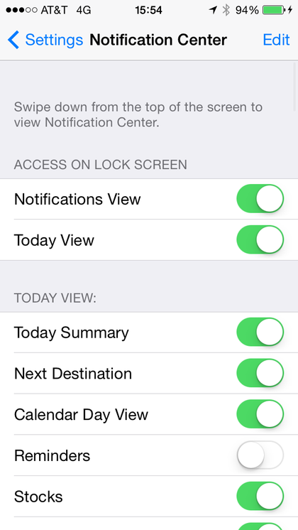
My macro design rage starts when I attempt to un-fuck myself from my notification choices. Here’s the Notifications Center screen in iOS 7.1:
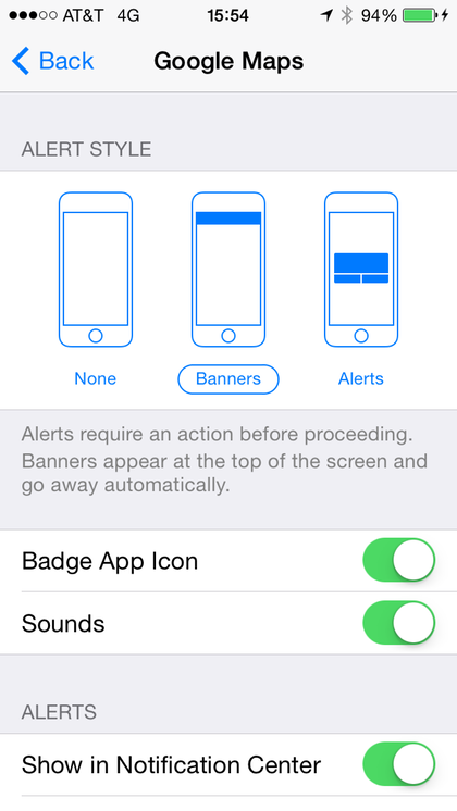
I realize the suggestion I’m about to make is possibly ridiculous, but how do I turn off all notifications short of turning off the phone? Where is the big huge button that allows me to take control back from the bevy of applications that – yes, with my permission – are spamming me with reminders I don’t actually care about? To achieve this goal, I need to go app by app through the list and turn them off. Sounds simple right? Here’s the notifications screen for Google Maps, which is the default notification screen for most applications:
Same suggestion, how do I turn off all notifications for this app? Does an alert style of NONE mean they’re off? Nope. What if I remove them from the Notification Center? Go ahead, take some time and figure it out for yourself. It’s not obvious.
I don’t believe that Apple designed notification management to be user hostile. My belief is that they haven’t figured out a holistic user-friendly model for both notification consumption and management. The design was built from the application up and not from the user’s experience down, which means they considered what was best for the application, not the user.
It’s not a bad approach, but it doesn’t design for the case where every app developer gets what they want: notifications enabled to make sure that I don’t forget about their application in the sea of applications on my phone. This design pattern makes it easy to opt in, but difficult to opt out.
This is by no means the most egregious or evil use of the design pattern. Have you ever tried to cancel a credit card online? Or your cable service? Businesses have little incentive to make it frictionless to allow you to do this because they know if they make it hard or require you to talk to a human that they greatly increase the chance you’ll become frustrated and stop before you finish.
Here’s another: How do I unfriend everyone that I haven’t interacted with in the last year? If I want to find ten new friends, it’s really simple. There’s an intuitive interface that makes finding new friends trivial. In fact, as part of writing this piece, I found six new folks that I should be following. Unfollows? Zero.
I understand that whether we’re talking notifications or friends that I’ve made choices that left me with numerous notifications and significant friend updates. I understand that on a case-by-case basis that I can fix my situation, but my design rage comes from the fact that when my interests aren’t in line with the business’s interests, the design becomes high-friction. Facebook has little incentive to allow me to unbuild my network of friends because my value is likely defined by the amount of data I generate. The larger my network, the larger my set of data.
The Design of Why
I don’t buy Apple hardware and software because it’s pretty – it doesn’t hurt that it’s pretty – but the reason I buy it is the same reason I lusted after the Mac 30 years ago. The design is deliberate. It works how I expect it to work. Not how Apple expects it to work – how I expect it. It’s clear that those brighter than I made choices to make my favorite acts of building contain less friction.
Notifications in iOS are still bad. They’ve improved significantly since the release of iOS, but while they’ve increased their usefulness and visibility, notifications’ usefulness are inversely proportionate to the number of notifications in use.
I expect high friction design patterns when I leave the beaten path of Facebook because I’m paying for it with my data. For Apple, I paid for the products, so I expect to not be punished for being gullible.


Odd. I am a massively cantankerous design critic who uses my iphone faiy heavily, and this has never been something that I recall annoying me. Checking just now, the only notifications I’ve received are from words with friends, metadata+, and eBay… Nothing particularly annoying. I think it’s because I always pause before hitting the accept notifications dialog, and usually say no… I don’t really think it’s a design flaw on the part of apple’s notification system if users give access to terrible developers – a notification isn’t really of any use unless it’s obtrusive, and if you don’t want something horrible like Facebook intruding, don’t opt in 🙂
They so often get design right that I set the bar pretty high for Apple, but when they miss it they miss it wide. Yesterday I got an email telling me that my iCloud Storage is almost full. I spent half an hour trying to figure out what I could do about it, other than buy more storage, which is the only solution the email suggested. Given that I didn’t even know I had iCloud storage, never explicitly asked to put anything there, and don’t care about any of it, obviously I’m not going that route. After this much friction, eventually I decided to just ignore the whole thing. Now I’m annoyed with Apple because of something I didn’t even know existed; probably not a good design goal.
Like reader Andrew, iOS notifications have not driven me to apoplexy, though I very much appreciate your pointing out that notification is primarily a business feature. Now, as to the design of your rant-essay ? Totally fab 😉
You’re doing it wrong. For one, stop enabling push notifications for your apps when you first launch them. Turn them on later, only if you realize that you’d prefer to be getting them. Any apps that send you push notifications that you don’t care about should be turned off, which you can easily do. Doing it backasswards and complaining that the result bothers you is an odd thing to write about.
There may be an element of intentional friction in the lack of a convenient off switch, especially if there’s money to be made by keeping you on the hook. However, I don’t think you can rule out developer enthusiasm for the “fun” bits of a project and management/bean-counter pressure to deliver products sooner rather than later as a contributory factor. It’s the same set of circumstances that give rise to, for example, database applications that don’t provide a clean way of managing data volumes or out of date information.
I’m surprised the Notification Center doesn’t tell you it would be more useful if you turned on WiFi. Every time you got a notification.
I reject all Notifications until I’ve decided I’d like the app to be more real-time. Less noise.
Maybe Apple in a rush to cover Android’s edge in notifications, went down the rabbit hole of “give user more control”. Without realizing that it’s actually a crap option for user, because they mismanage their choices and end up in a sub-optimal situation like yours. They definitely need a “do over” button and a notification volume control.