The Rands “R” started many years ago as this:
I’ve been toying with branding, design, color, and other marketing elements for the site for years. I remember spending a couple of weekends trying to get a good picture of the weave of my favorite beanie as background for the site. That’d didn’t go well.
I don’t recall why Cyan caught my attention, but it became the glyph for the site. Many years later, Gruber commented, “It’s you. It reminds me of a slightly untucked dress shirt.”
High praise.
As I wrote about over four years ago, I updated the R with the help of the design skills of Collin Roe-Raymond, a former co-worker and always fantastic designer. He built what we now call Super Cyan and some other variants.
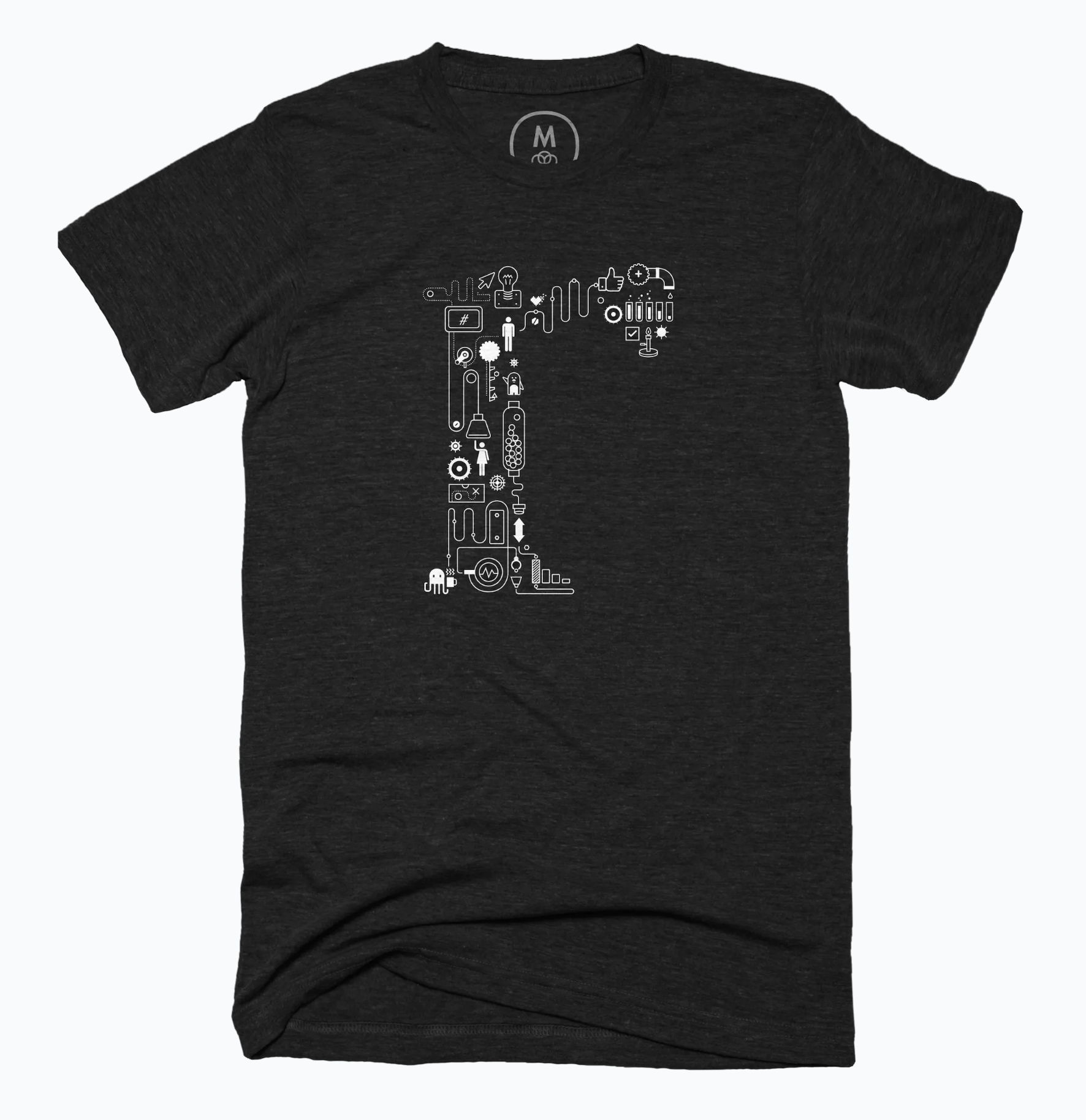
I thought about the new R as I thought about this year’s charity shirt. I was also thinking about what has been the most successful shirt in the growing catalog of Rands t-shirts which is: The Zone
We combined the Super Cyan R with the Flow ascetic into a design we dubbed Goldberg (See: Rube Golderberg). Look closely at Goldberg; many Rands greatest hits are hidden amongst the intricate design.
As with all shirts, all profits for this shirt go to National Alliance for Mental Illness. Between now and the end of the year, I’ll 2x match all profits for all shirts for this worthy cause.
Have a great holiday season.

