Ok, stop reading right now and count the toys you can see from your desk. Don’t ask me for a definition, just count.
Ordered by proximity, I’ve got:
 The amethyst ball the Mom gave me.
 A hockey stick given to me by a prior team. Near this hockey stick is a hockey puck.
 A cup-sized brass bell along with a small bell-ringing device.
What’s your count? Zero? Really? Loosen up your definition and try again. Thirty? Wow, do you ever get any work done?
For me, toys are yet another means of a mental punctuation. As I slowly page through my day, I engage these toys for a mental break. The amethyst ball is my tactile fidget “not sure what to do next” device; the hockey stick is my “break the cycle of sitting at the desk and score one for the New York Rangers” break; and the bell, well, you’ve got to hear the bell to understand that it’s the perfect musical mental reset.
I’ve had various toys in my office since I started in high tech, but it’s only in the last six months that I’ve discovered how we can use the rules of toys in both interface and application design.
The Rules of Toys
A well-designed toy:
- Makes a request. It asks you to “Play with me”. This is why you are compelled to touch it.
- Is fantastically straightforward. The design suggests, “When you pick me up, it’s going to be clear what’s going on.” This is why great toys never have manuals.
- Has hidden potential. A toy is going to hook you with some clever visual, but the real value is something you can not see, but must find.
- All of this leads to the fact that a well-designed toy is instantaneously fun and who doesn’t want to have fun?
Now there are very different kinds of fun that a toy imparts. The monkey fun we get out of throwing a frisbee feels different than the Einstein fun of figuring out the Rubik’s Cube, but regardless of where you park the fun in your brain, you’re still playing with a toy.
While it’d be entertaining to design all products and user interfaces with these rules in mind, we’d never actually get anything productive done. It’d be really hard to listen to your music if the interface was a Rubik’s Cube. Or maybe not… wait, someone write that down. The point is that you need to be selective where you apply the toy rules and the best way to explain this is to show you how it’s done.
Any Idea What This Is?
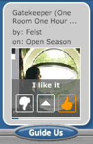
Pandora. Once you’ve selected a song or an artist, Pandora starts merrily playing your related music via their music player. Invariably, Pandora will play something you hate and you’ll want to get rid of it, so you’ll check out the interface where your mouse will hover over the cover art and you’ll see this: 
This is a toy interface. It’s straightforward, it’s simple, it’s not exactly clear what’s going to happen when you start clicking on those thumbs, but you’re being invited to do something.
Yes, you have cultural touchstones as to what “thumbs up” and “thumbs down” means and this gives you some idea what clicking one or the other will accomplish, but, more importantly, these thumbs empower you to make a difference, make a judgment even if you might not understand exactly why. There’s a silent contract that by clicking on these little playful glyphs that you’re going to somehow improve your Pandora musical experience.
Let’s keep moving…
 Any idea what this is?
“No, Rands, but I just want to reach out and touch it.” Me, too.
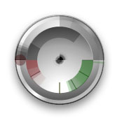
This is iPulse. It’s a system monitoring utility from Iconfactory, which is arguably the king of toy application development.
Now, a screenshot isn’t a fair means of analysis of iPulse because its interface isn’t static, and the application is an interactive experience. As you run your mouse over the interface, you see all sorts of statistics regarding your system. But at a glance, the design of iPulse is a toy. It’s encouraging you to explore. There are system monitoring tools out there that spam you with all sorts of statistics regarding your memory, hard drive space, and network activity, but the iPulse approach is the opposite. They start with a question, “What if understanding how your computer worked was an exploration?”
No, this design isn’t for everyone. Hardcore performance nerds are going to be quite happy running top in a terminal window, whereas iPulse uses a playful design to hide the nerdery behind a toy and give you a chance to learn. In the middle of the day, when iPulse is pulsing and blinking in the corner of your screen, you’re going to start to tinker with it and you’re going to discover, “Hey, Mail.app has totally lost its mind and is eating my CPU. Now what?”
The hidden consequence of playing is that you learn, and how would you prefer to learn, from a textbook or a toy?
The examples so far demonstrate the toy rules for portions of an application or for a simple utility, but the real question is: can you build an entire application using the toy rules? Sure you can.
Twitter is a Big (Important) Toy
Let’s see if Twitter obeys the rules:
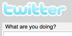
Does it make a request?

Is it fantastically straightforward?

Doesn’t get much simpler than that.
Does it not present obvious value (but it’s there)?
The blogosphere can’t shut up about whether there is value in Twitter or not. Like weblogs, the opinions range from “It’s a fad” to “IT’S GOING TO CHANGE MEDIA AS WE KNOW IT”, but neither is the lesson.
The first lesson is that the fact that folks can’t shut up about Twitter means there is obvious value, even if no one can articulate what that value is. The second lesson is simply that people like to play, and Twitter is a communication medium designed as a toy, which leads us to the last rule…
Is it fun? Yeah, it is fun. Forget about the organic social network that springs up around you, forget about Twitter’s current spotty performance, and realize it’s fun to summarize your mental state every hour or day. Think of it like this: if you had to give your state of mind a chapter title, what would it be?
Twitter is also a reminder that there’s another toy rule that I haven’t mentioned. In its hidden potential, a well designed toy allows each person to build their own unique experience.
Choosing When To Play
Designing with the toy rules is not a solution for all design problems. You might want to employ the toy rules when it’s important that your users not only focus on part of your interface, but it’s also important that they remember it. Giving your users a toy, an interface that is going to invite them to play, is also going to invite them to explore, and when they’re exploring, they’re learning.
Toy interfaces are also great at turning a terribly complex idea into a simple interface. Yeah, you might lose information fidelity by tucking your complexity inside a toy, but would you rather your users stop at confused, or would you prefer to give them a chance at discovery? Again, the value of any toy is not obvious, it must be discovered. No, it must be a joy to discover.
Great insights and excellent writing. Loved it!
So I just got back from a San Francisco vacation with my woman and I have one question for you Rands.
What the hell is up with Kron4? Do they all do a couple bonghits before they go on the air?
“It’d be really hard to listen to your music if the interface was a Rubik’s Cube. Or maybe not… wait, someone write that down.”
You were beaten to that one by a decade and a bit, albeit in animation. (The bit about Mihoshi’s Cube.)
“This odd device can access dimensional space … Unfortunately, it operates much like a Rubic’s Cube, with the operator having to turn the sides to get the desired effect. In Mihoshi’s hands, this pretty much means any effect is random, although it seems she has some idea what combinations do what.”
Anyway, my own anime addiction to one side … another good post and a sound selection of insights. Indeed with games on the table, you’re veering into another of my must read authors: Danc. Game design torn apart and thrown back together again, when he’s not giving away art.
Oddly, none of my nearby toys were particularly interactive. Guess I’m more into mascots despite my interests!
The toy interfaces thing interests me, because it ended up being the subject of debate at ETech this year.
The theme of the whole conference was magic, and many of the talks ran this into the ground, as expected. There were many cool, magical, toy-like things shown. My favorite was a nod towards Konami’s Tamagotchi-like Otoizm, which sits between your headphones and your music source and grows based on what kind of music you give it.
And then it goes out and generates music it thinks you’d like.
Oh, and it wirelessly finds other people with one and compares how compatible you are based on music preferences.
Anyhow, there was one presentation that stood out as rebuking the whole interface-as-magic thing; Adam Greenfield basically said that magic/toys/seamlessness was crap, and that people should strive for “seamfulness, but with beautiful seams”. Too often, toy interfaces gloss over too much (as you mentioned) and don’t expose themselves for add-on functionality and/or API hooks.
The point: I think there’s a happy medium to be reached. I’d rather have a interface with some seams that still encouraged me to explore.
But that’s just me.
fl0w – an awesome toy:
http://intihuatani.usc.edu/cloud/flowing/core.html
will eat much time if you are not careful
The best toys are improvised, or unintended as toys. The clip-on monitor-cowboy I made from twist-ties, server packaging foam, those excellent air-pillows, that weirdly-shaped piece of plastic from your switch mounting-kit…