Sticking with our Keynote theme for the week, Andy has solid and usable advice for building your non-boring slide deck. One thing I would add is to create a test slide at the beginning of your deck which contains the following:
- A border which represents the expected resolution of your slides,
- A set of colored objects which you know,
- Text formatted in the fonts you use in your deck, and,
- A big circle.
Something like this:
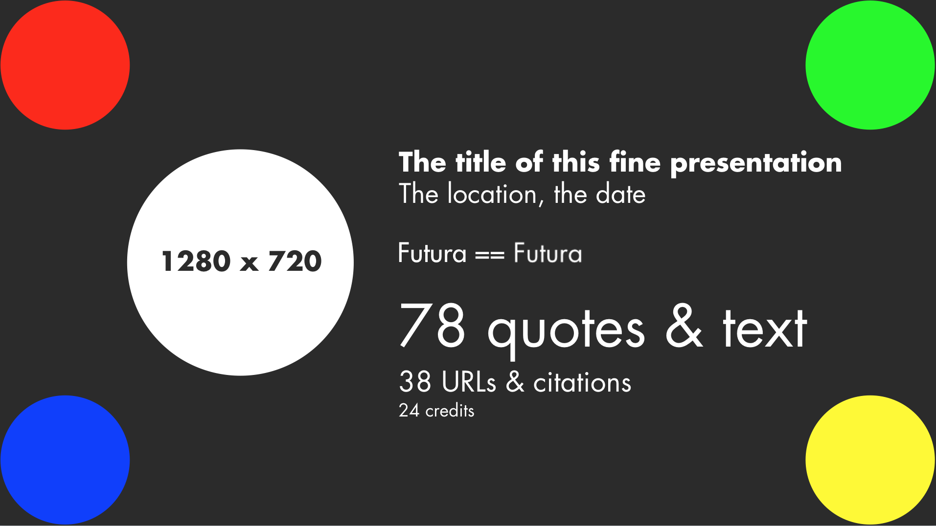
The reason for this slide is so that when you’re doing that inevitable run through of your deck, you can easily answer the questions:
- Is all of the usable space on your slides being displayed correctly.
- Do the colors look right?
- Are your fonts loaded correctly?
- Is the aspect ratio correct on your slides? (Hint: if the circle isn’t a circle, it’s not)
UPDATE: Here’s an awesome fork by Tim Brown in Keynote.
SECOND UPDATE: Here’s the current version that I’m using which is used in the screenshot above. You’ll likely receive a font warning when you open this and that’s the point.